Platform Features Release: Additional Features/Adjustments to Streamline Functionality
Announcing the latest Release of feature and functionality additions and enhancements to the trading platform to streamline/improve functionality.
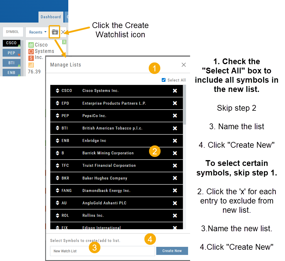
Build a Watch List from “Recent” List
Build a new Watchlist directly from the “Recent” list in Research.
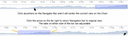
Navigation Bar
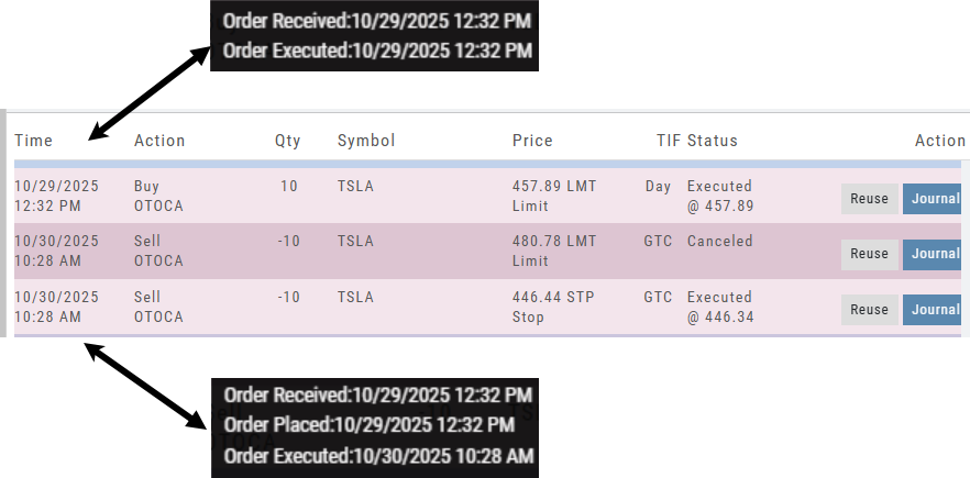
Order Status Time Stamp
Hover your cursor over the Order’s Date/Time info to display the Order’s activity Time Stamp.
Other Additions
- Enter a symbol, and it will appear in the symbol box. This works on any of the Research tabs.
- Adding a symbol when Creating a new Watchlist automatically adds to the list. The “Add” button has been removed.
Change Log
- Corrected “Close” action from Staged Trade
- Trailing % display corrected
- Renamed tooltip from “Add Watchlist” to “Create/Delete” vs. “Add/Delete”
Platform Features Release: Sandbox Trading Account, Order Status Filter & more
Announcing the latest Release of feature and functionality additions and enhancements to the trading platform to assist the investment/trading decision process.
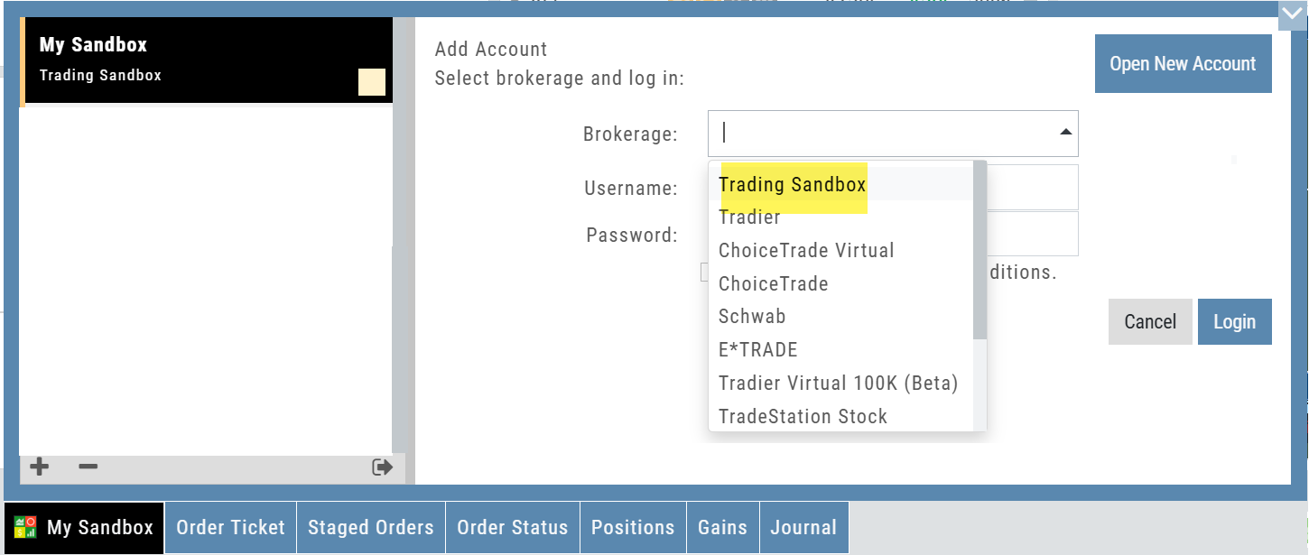
Trading Sandbox Virtual Account
Announcing a new Virtual Account with fast execution, accurate tracking, and reliability you can depend on.
Unlike traditional broker-provided virtual accounts, the Sandbox is not bound by brokerage margin rules or limitations, giving you more freedom to practice and test strategies.
The Sandbox uses delayed market data. In addition to fast, reliable trade execution and accurate trade capture, it also handles options correctly, supports Conditional Orders for stocks, full Journal Support, and more!
Order Status Filter Buttons
The Order Status Tab filter buttons make it easy to locate previous orders
![]()
- All – Everything in the time period is shown on the tab (Today, 1 Week, 1 Month, etc.).
- Open- Orders that have not yet executed as an active Trade/Position – includes Waiting Conditional orders.
- Working – Bracket orders where the underlying stock order is an active position (Stop/Limit orders). Excludes Waiting Conditional orders.
- Filled – Executed orders whether to open/modify/close
- Canceled – Includes both manually canceled as well as day orders that did not get filled prior to the end of the Market Day
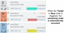
OCO Journal Tagging
OCO Orders are automatically tagged in the Journal.
Once the Stock Order is Executed (it is an active Position), the Limit and Stop orders are Live (active Orders for the duration selected: Day or GTC.)
If/when the stock hits the Limit price, that order will execute, and the Stop order will be canceled. The Journal tab will be green and display a Gain/Profit.
-OR-
If/when the stock hits the Stop price, that order will execute and the Limit order will be canceled. The Journal tab will be red and display a Loss.
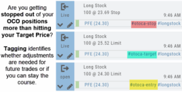
**Note: Past Conditional trades will be tagged as “otoca-entry”, “otoca-target” and “otoca-stop”.
Delayed Streaming Quotes
Delayed Streaming Quotes will appear when you have a Virtual or Manual Account activated.
Click on the account tab so that it appears on the bottom left corner of your screen.
Extend Fibonacci Retracements on Charts
Fibonacci retracements can be extended right and/or left on the chart.
Click an existing Fibonacci annotation, then use the toggle switches to adjust it.
Don’t forget to “Save”
Note: Extend Right/Left can be edited/saved individually, not Set As Default.
Chart crosshairs
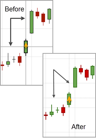
The cursor crosshairs on the chart have been adjusted so they no longer obscure the candlestick wicks
Other Additions
- Set “GTC” as default duration for Exit Order on Trade Ticket
- Modify TTM Squeeze formula to follow industry
- Auto-select Option Cycles for existing Order(s)
Change Log
- Resolved Screener glitch to move candidates to selected watch list
Platform Features Release: New Zoom Functionality, Chart Panning
Announcing the latest Release of feature and functionality additions and enhancements to the trading platform to assist the investment/trading decision process.
New Zoom Functionality
To activate Zoom, click on the Zoom button has been added to the icon toolbar:
![]()
- Once activated, the button changes color.
- Click/drag the mouse/cursor over the area of study.
- A “Reset Zoom” button will display when you want to restore the view.
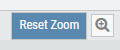
Chart Panning Functionality
Click/drag now pans the time period/price range on the chart – when dragging your mouse/cursor either right/left
Other Additions
- “Choppiness Index” Chart Lower Indictor added
- “Are You Sure You Want To Cancel This Order?” added on Order Status tab
- Clicking on “Quotes By” box (lower right corner) will display source of quotes
Change Log
- Reuse .XSP and .SPX order functionality restored
- Trading Block OTM trade error fixed
- Schwab recognizes BRK.B now
- Resolved Liquidity Range in Screener
Platform Features Release: Alert and Chart Feature Enhancements
Announcing the latest Release of Charting and Alert enhancements.
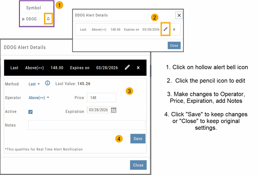
Edit Alerts from any Accessible Screen
Price Info added to Go Big Chart View
Last, Bid, and Ask values have been added to the Big Chart window, with Trade capability
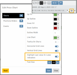
Price Chart Control
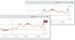
Toggle switch on/off to show/hide last value of certain lower indicators.
Change Log
- Price Slices bug fix
- Brokerages to set Virtual Account Limits
Platform Features Release: Annotation Enhancements, Condor Trade Set Up
Announcing the latest Release of Annotation improvements and Strategy template adjustment. We’ve also made several practical changes for better access to features/functions.
Independent Default Settings for Annotations
When adding Annotations such as lines, rays, arrows, etc, to the chart, the settings for that type of annotation can be set as a “Default”. Line settings are independent of other annotations’ settings.
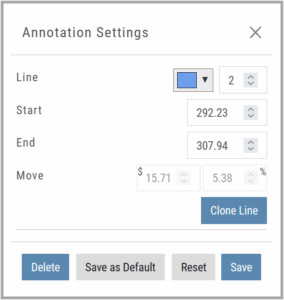
Add the Annotation.
Click on the annotation to display the Dialog box (shown).
Make any adjustments.
Click “Save as Default”
The newly added and future annotations of the same type will have the new settings.
Click “Reset” to revert to original settings.
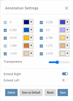
Fibonacci Too!
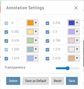 The Fibonacci Annotation has been enhanced to allow you to select which Retracement Levels you want to view in addition to adjusting the color for each as well as transparency overall.
The settings can be set as the Default for new chart entries.
**Please note: Existing Fibonacci annotations cannot be edited with this new coding. They must be deleted, then added back.
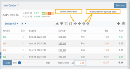
Condor Strategy Template Adjustment
The core functionality of Condor Strategy Templates has been adjusted. (Iron/Long/Short)
The center strikes are now anchored by default and will only change if you adjust them manually on the template itself or by using the “Widen Strike” icon —making trade construction more intuitive and consistent.
Widening/Narrowing of the center Strikes will change the spread of the Condor, which can be done manually on the template or by using the “Widen” or “Narrow Spread” icon.
Other Additions
- EOD lower Indicators will display “Chart Unavailable for intraday charts.”
- Zoom feature now includes a double-click “on-off” functionality
- HeatMap legend (Find>HeatMap) is movable
Change Log
- Heatmap legend is no longer fixed when clicked to view
- Transparency for shapes is resolved
- Price slice functionality adjusted for price changes
- Zoom feature is now toggle functionality
- Scrolling chart/arrow functionality resolved
Chart Adjustment/y-axis
Chart Adjustment
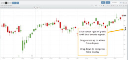
Adjusting the chart’s y-axis gives you more flexibility – whether it’s forecasting, adding notes, viewing current positions, etc.
Simply click you cursor to the right of the y-axis, then drag your mouse/cursor up or down.
To reset, click the ‘refresh’ icon ![]() on the chart toolbar
on the chart toolbar
Platform Features Release: New Zoom Functionality, Chart Panning
Announcing the latest Release of feature and functionality additions and enhancements to the trading platform to assist the investment/trading decision process.
New Zoom Functionality
To activate Zoom, click on the Zoom button has been added to the icon toolbar:
![]()
- Once activated, the button changes color.
- Click/drag the mouse/cursor over the area of study.
- A “Reset Zoom” button will display when you want to restore the view.
Chart Panning Functionality
Click/drag now pans the time period/price range on the chart – when dragging your mouse/cursor either right/left
Other Additions
- “Choppiness Index” Chart Lower Indictor added
- “Are You Sure You Want To Cancel This Order?” added on Order Status tab
- Clicking on “Quotes By” box (lower right corner) will display source of quotes
Change Log
- Reuse .XSP and .SPX order functionality restored
- Trading Block OTM trade error fixed
- Schwab recognizes BRK.B now
- Resolved Liquidity Range in Screener
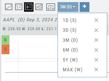
Chart Time Period
Chart Time Periods
The Chart Period format has been streamlined for a more streamlined look.
The current chart period will be displayed at the top of the ‘favorite’ (saved) drop-down list.
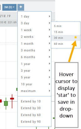
“Extend By” can also be selected to “add time” to the left side of your chart.
Platform Features Release: Economic Dashboard, Chart Adjustment, Chart Time Period
Announcing the latest Release of feature and functionality enhancements to the trading platform to improve the investment/trading decision process.
Economic Dashboard: View chart data from dozens of economic reports. Includes information on why it is important, what to look for, and how to apply the data to trading.
Chart Adjustment: Ability to compress and expand y-axis.
Chart Periods: New look, improved functionality.
Economic Dashboard
Located under the Home/Market Tab, this powerful research tool provides important economic information in chart format.
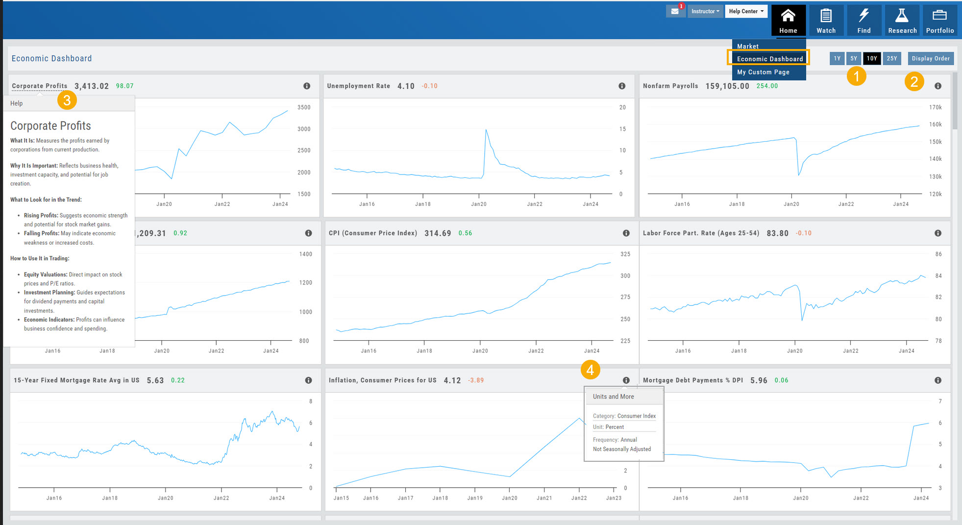
- Select from 1*, 5,10 or 25-year views
- Allows you to select display order as well as ‘hide’ charts.
- Click on the Title to display: What the data represents, Why it is important, What to look for and How to apply the data in trading
- Provides info on the Economic Report Category (Consumer), what the numbers represent (%, $, units, etc), how Frequent the data is reported (Quarterly, Annually, Monthly, etc)
* Some reports are released annually. 5, 10 or 25 year view are recommended in these instances.
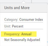
Chart Adjustment
Adjusting the chart’s y-axis gives you more flexibility – whether it’s forecasting, adding notes, viewing current positions, etc.
Simply click you cursor to the right of the y-axis, then drag your mouse/cursor up or down.
To reset, click the ‘refresh’ icon ![]() on the chart toolbar
on the chart toolbar
Chart Time Periods
The Chart Period format has been streamlined for a more streamlined look.
The current chart period will be displayed at the top of the ‘favorite’ (saved) drop-down list.
Change Log
- ‘x’ moved to left side of symbol list in Research Tab
- Key Ratio and Compare Views are session sticky
- Seasonal chart corrected to show Price
- Cancel/Reuse display on Credit orders corrected
- Stock data restored on Scan backtest
- Staged Order display on chart functionality corrected
- Schwab Order Ticket close orders corrected
- Trade Station added under “Open New Account”
- Reward/Risk more clearly marked on Trade from Chart
- 1 Day/1 Minute added to Custom Page charts
- Resolved Seasonality percent chart
- Corrected MACD histogram overlap
- 60-minute charts/Schwab conflict resolved
- P/L Insight Graph includes up-to-date data
- Tradier Live Account Ticket credit/debit correction
- Staged Orders/Current Orders display consistency restored
- Screener – Score resulting in 0 candidates resolved
Platform Features Release: Trade from the Chart, Price Slices, Reset Virtual Account Options
Announcing the latest Release of feature and functionality enhancements to the trading platform to improve the position evaluation process, trade submitting process as well as offer additional practice account settings:
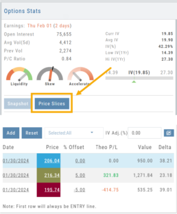
Price Slices: Evaluate theoretical outcomes of option positions when using the Strategy Templates.
Trade from the Chart: Use the control box or lines on Chart to adjust the entry point, Target Price and/or Stop Price.
Reset Virtual Account – Add ‘funds’ to an existing account OR reset everything and start fresh. You decide.
Price Slices (Premium Feature)
The ![]() Button appears on the right side of the screen when using the Strategy Templates.
Button appears on the right side of the screen when using the Strategy Templates.
Select one of the 22 Option Strategy Templates.
Build the position.
Click the Price Slices button to start your evaluation
Change the Date (default ‘today’), Price levels and/or % Offset
Add IV to view how this affects the theoretical P/L
Click the Go Big icon to view additional Greek data
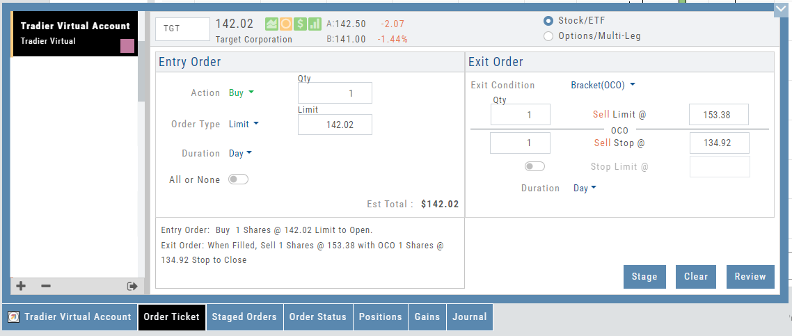
Trade from the Chart
The ![]() button appears at the top of the chart for any symbol – whether there is an existing position or not.
button appears at the top of the chart for any symbol – whether there is an existing position or not.
Clicking this button activates an Order Window on the Chart, like this:
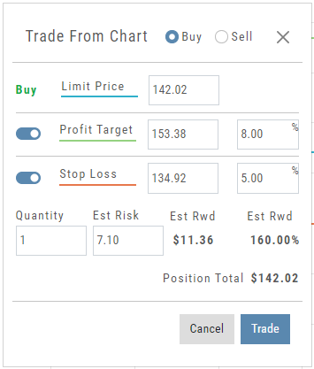
Note: Buy, Profit and Stop Loss line colors will match those displayed on the chart itself.
The values in the Order Window can be manually adjusted by $ or %
The values can also be dynamically adjusted by moving the corresponding line(s) on the Chart itself.
The Quantity value default is “1” to show the ‘per share’ dollar and percentage estimated risk, reward, as well as Position Total.
Click “Trade” for the prefilled Order Ticket to display.
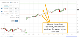
The Order Ticket can be further adjusted, Staged or Reviewed to ensure it’s completed to your satisfaction, then Submitted.
Note: The brokerage selected must support Bracket Orders if the Stop/Stop Limit values are selected on the Order Window
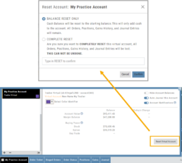
Reset Tradier Virtual Account – 2 options
Tradier’s Virtual Account gives you the ability to add more “Cash” to your practice account – OR – completely start over:
On the account summary page, click “Reset Virtual Account”
Select “Balance Reset Only” – to keep your existing trade activity, but add more “cash” to your virtual account.
Select “Complete Reset” – if you want to remove all prior transactions, including Journal Entries, Gains, Orders, Positions, etc. Note: This selection cannot be undone once it’s processed.
Type RESET in the box provided, then click the “Confirm” button
Enhancements
- ATM Option Strikes are bolded for easier identification
Change Log
- Adjusted theme contrast
- Corrected Order Type Limit price entry
- Snapshot functionality restored