
26-09-27 Release Notes: Enhancements/Fixes
TradeTool Platform
Release Notes
Improvements
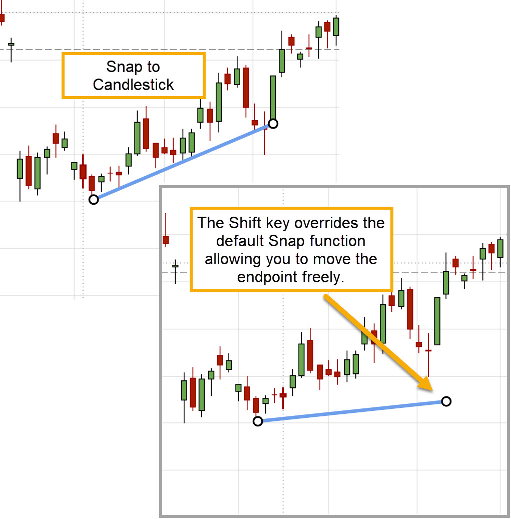
Shift Key Overrides Snapping to Candle
Hold the Shift key to override lines/annotations snapping to candle on the Chart.
Trade From The Chart
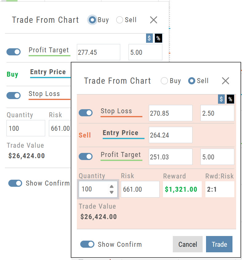
Bracket/OCO order setup now differentiates between Buying and Selling, with a red display for Sell activity.
- Buy keeps the standard display, with the Profit Target above the Entry Price and the Stop Loss below it.
- Sell switches to a red display, with the Stop Loss above the Entry Price and the Profit Target below it.
Percentage of Planned Risk
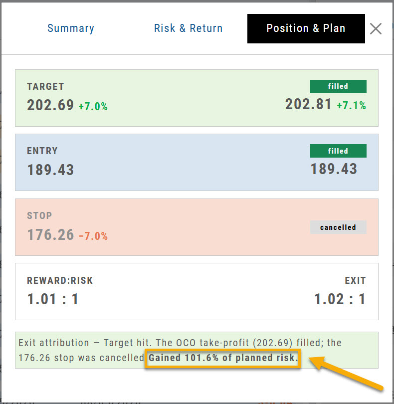
Percentage of Planned Risk has been added to the Journal trade results, as shown.
For example, the trade on the right hit its target. The exit attribution now reads Gained 101.6% of planned risk, which shows how the result compares to the amount you planned to risk on the trade.
Price Chart Changes Are Auto-Saved
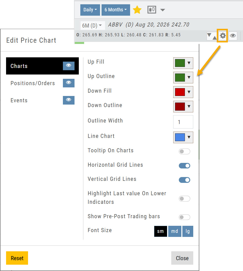
Changes to the Price Chart settings are now saved automatically.
Click the gear icon to open Edit Price Chart, make any changes, then click Close. Your changes stay in place until you change them again.
Manage Positions, Orders & Staged Orders Display on the Chart
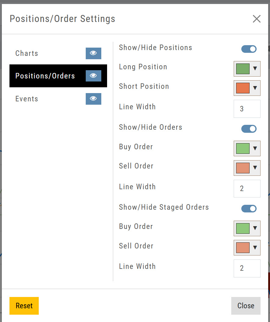
Click on the Price Chart Control gear icon, then Positions/Orders to manage Positions, Orders & Staged Orders on the Chart to further differentiate activity.
- Toggle to display or hide
- Select colors for Long/Short Positions
- Select line width
Manage Pre-Post Trading Bars on the Chart
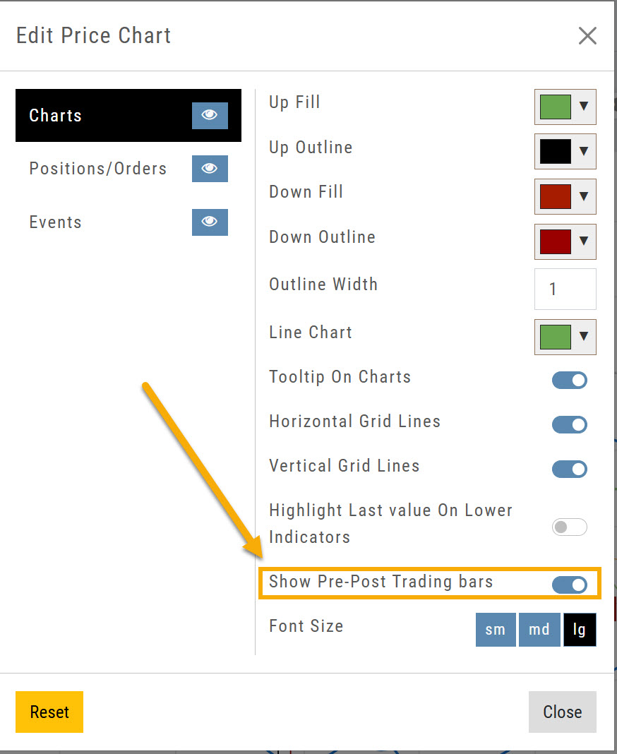
The Price Chart settings now let you display pre-market and post-market bars on intraday charts only.
Open Edit Price Chart from the gear icon and turn Show Pre-Post Trading bars on. If you don't want them, turn the toggle off.
Access Your Favorite Interval/Time Frame on Full Size Charts
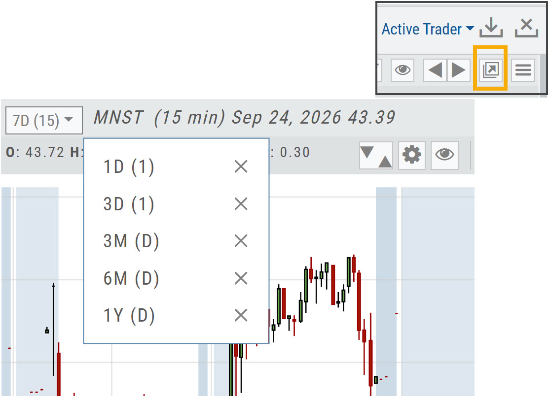
Click the Go Big icon near the upper right corner, above the chart, to expand the chart to screen size.
Your Favorite interval/time frame chart views are available from the top left corner of the chart.
ATR Added to the Stock Info Bar
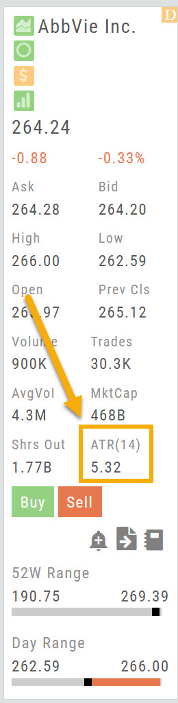
ATR(14) has been added to the stock info bar, next to Shrs Out.
ATR (Average True Range) shows how much a stock typically moves over the last 14 periods, a quick read on its volatility.
Fixes / Change Log
- FixedTradier Live: BNY Symbol: BNY now displays on the chart. (Positions showed the former symbol, BK, which changed to BNY in May.)
- FixedTradier: SEI Symbol: SEI no longer displays as SOI.
- FixedHome Page Sector Bar Graph: now updates.
- FixedCompare: company names now display.
- FixedChart Profiles: your chart profiles now save.
- FixedTrendlines: now extend past the last candle when time is added to the chart.
- FixedModify Orders on Chart: now works correctly.
- FixedSector List: Media & Telecommunications is back in the list.
26-09 Release Notes: Chart Period Controls, Journal Trade Results, Strategy Metrics
TradeTool Platform
Release Notes
Chart Period Controls
Interval and Timeframe are now set independently, giving you more flexibility when setting up your charts.
What's new
- Interval determines how each bar or candle is displayed — Daily, Weekly, Monthly, 1 Min through 60 Min, 2 Hours and 4 Hours.
- Timeframe determines how much historical data is displayed — 1 Day through 10 Years.
- Extend By 10, 30, 60 or 90 periods is now available within the Timeframe menu.
- Your selections are sticky — they remain in place until you change them.
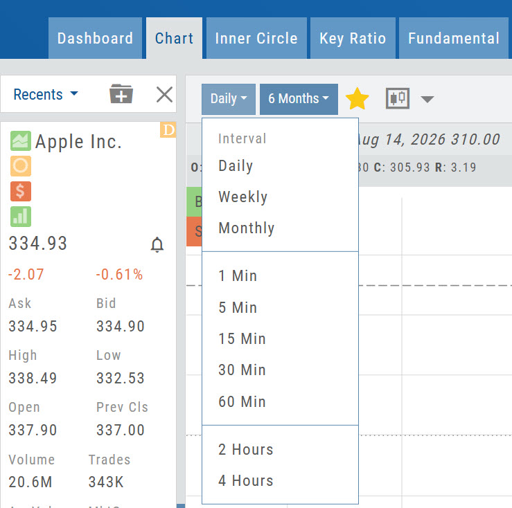
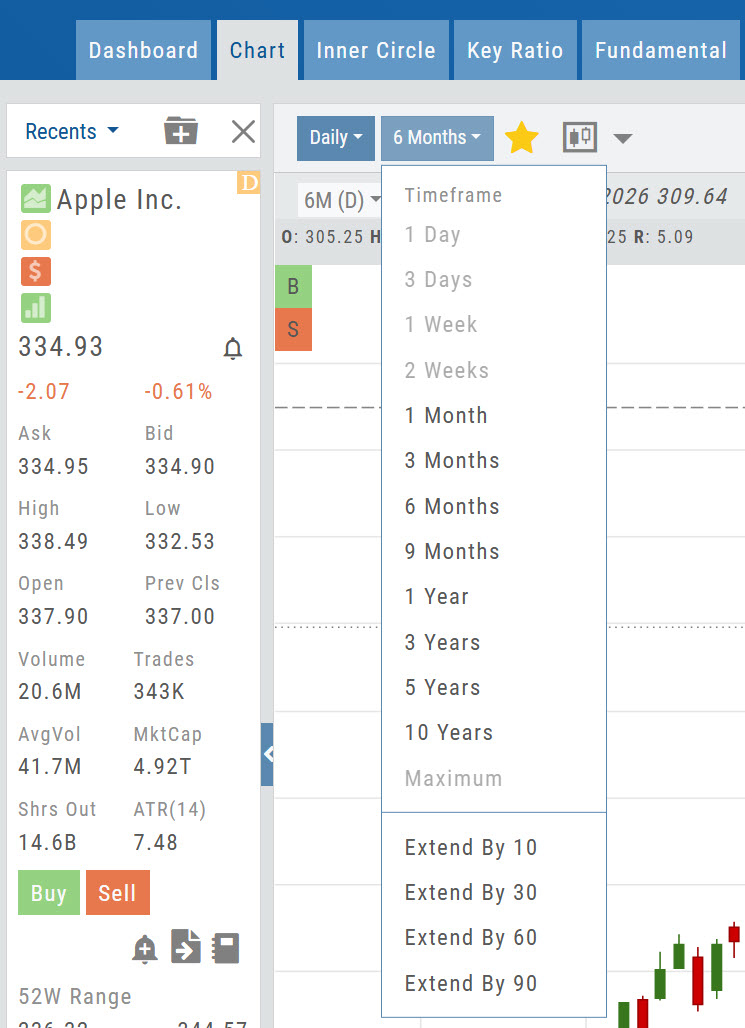
How the two menus work together
Compatible selections are shown normally, while unavailable combinations are faded. Selecting a 1 Min Interval, for example, allows Timeframes of 1 Day, 3 Days or 1 Week.
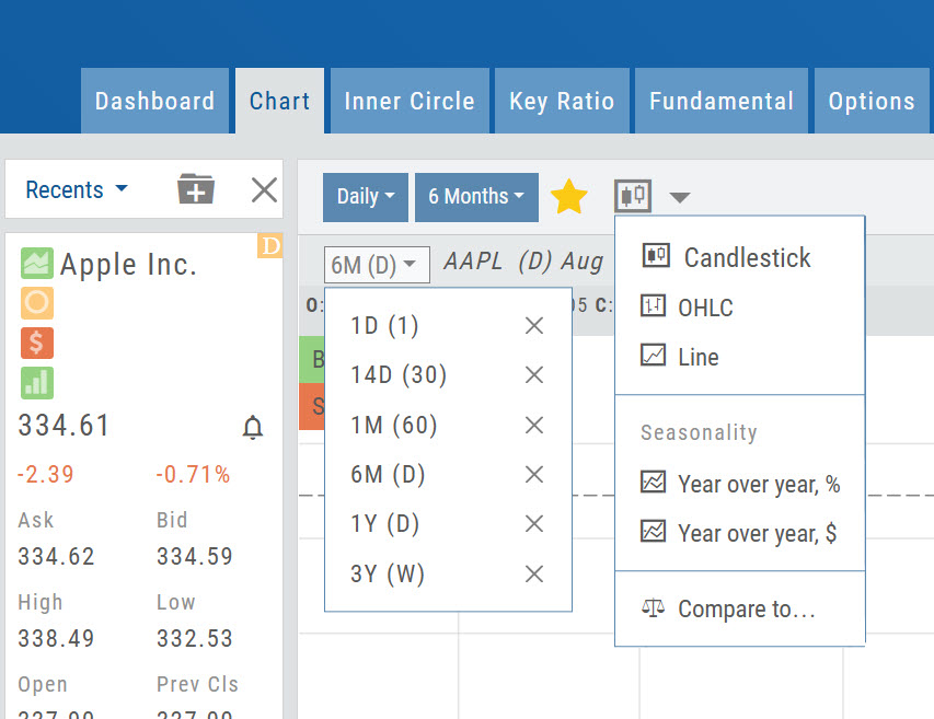
Access Your Favorites
The Interval/Timeframes that are Starred, indicating “Favorites” are stored in this drop-down.
To add a new “Favorite” click the Star to the right of the new Interval/Timeframe combination.
To remove: Select the one to remove and click the highlighted Star to remove.
Note: Chart Views selection has been moved to its new location. Select Line, OHLC or (default) Candlestick. Seasonality and Compare function capability are also housed here.
Enhanced Trade Results in the Journal
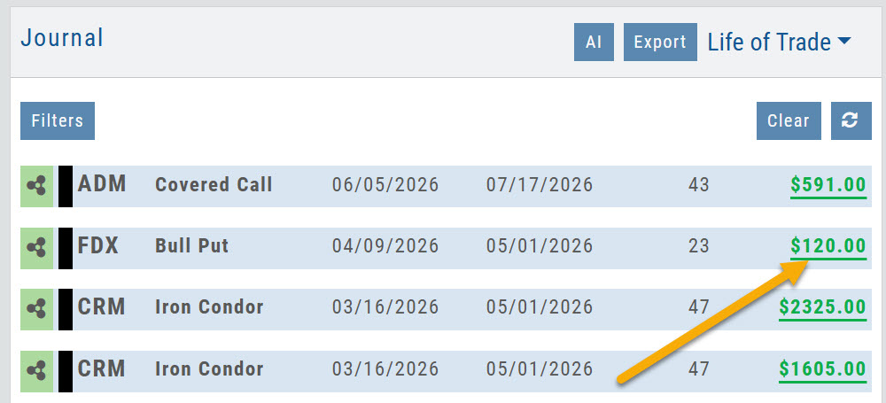
The Trade Journal provides a more complete view of your trade results — from entry through close, including adjustments and expirations along the way.
How to open it
From the Life of Trade view, click the Gain/Loss value on the far right of a completed trade.
What you'll see
- Trade performance at a glance — Profit/Loss, % of Target and trade duration.
- Visual trade history — entries, adjustments and exits shown directly on the chart, including OCO Stop and Limit orders when applicable.
- Risk & Return — compare the original trade plan with the actual outcome, including Reward and Return on Risk.
- Performance Evaluation — identify the factors that contributed to or detracted from the trade.
- Position & Plan details — see how the actual execution and results compared with the original plan.
- Options Trade Analysis — review key Greeks and volatility metrics, including Delta, Theta, Vega, Gamma, IV and IV Rank.
The tabs you see depend on the type of trade.
Stock trades
Summary · Risk & Return · Position & Plan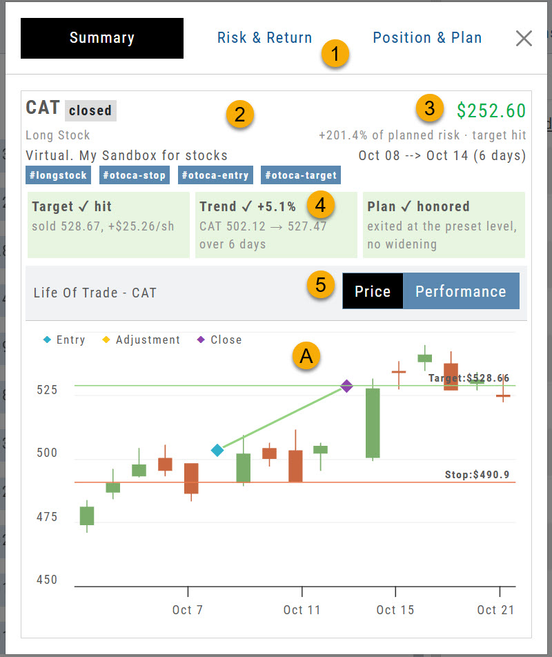
- Overview tabs — Summary, Risk & Return, Position & Plan.
- Trade summary — symbol, trade status, position, account and tags.
- Results — Profit/Loss, % of Target and duration of trade.
- Evaluation — color shows whether a factor contributed to or detracted from the trade.
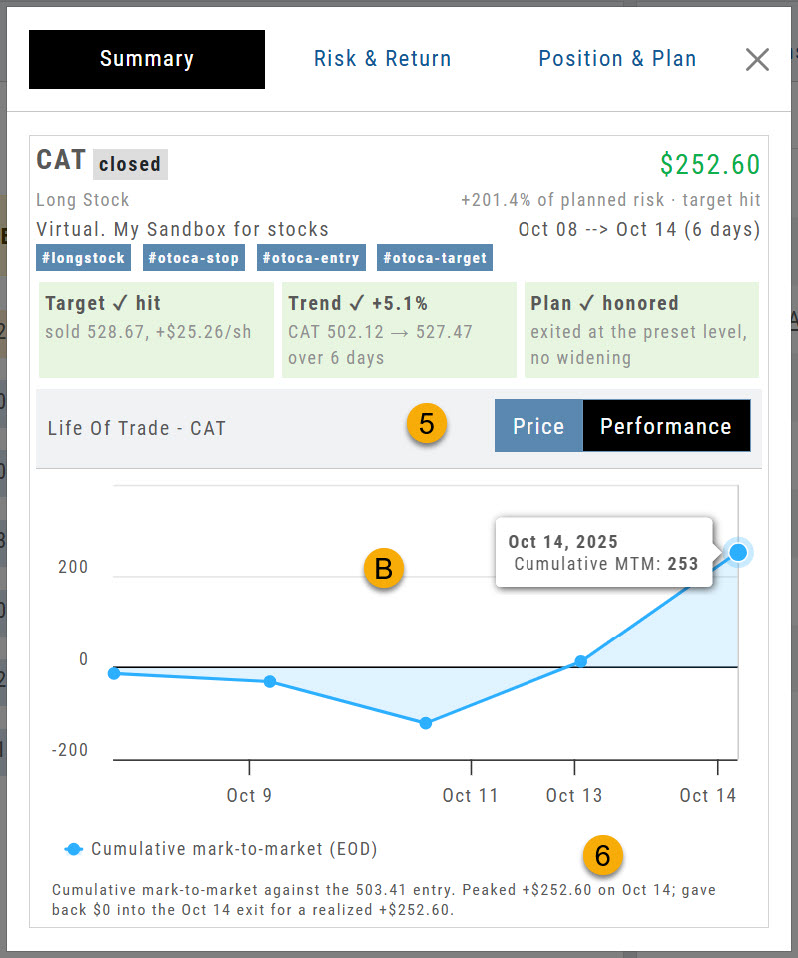
- Price / Performance — toggle between the two chart views.
- ACandlestick chart with position entry, adjustment and close — plus OCO Stop and Limit, if applicable.
- BCumulative activity across the trade duration.
- Summary of performance — a plain-language recap of the result.
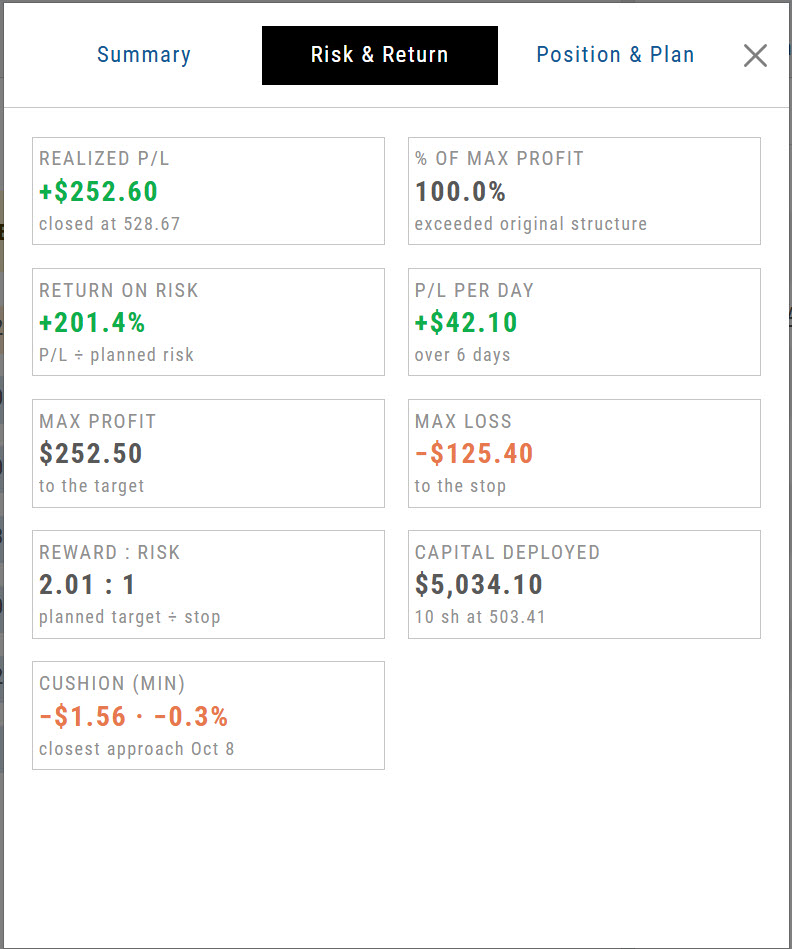
Risk & Return
Risk & Return sets the plan against the outcome. In this bracket order, 10 shares filled at $503.41 — below the $503.44 order price. Six days later the $528.66 target was reached and the close executed at $528.67, and the $490.90 stop was cancelled automatically. A planned Reward/Risk of 2.01 came in at 2.02.
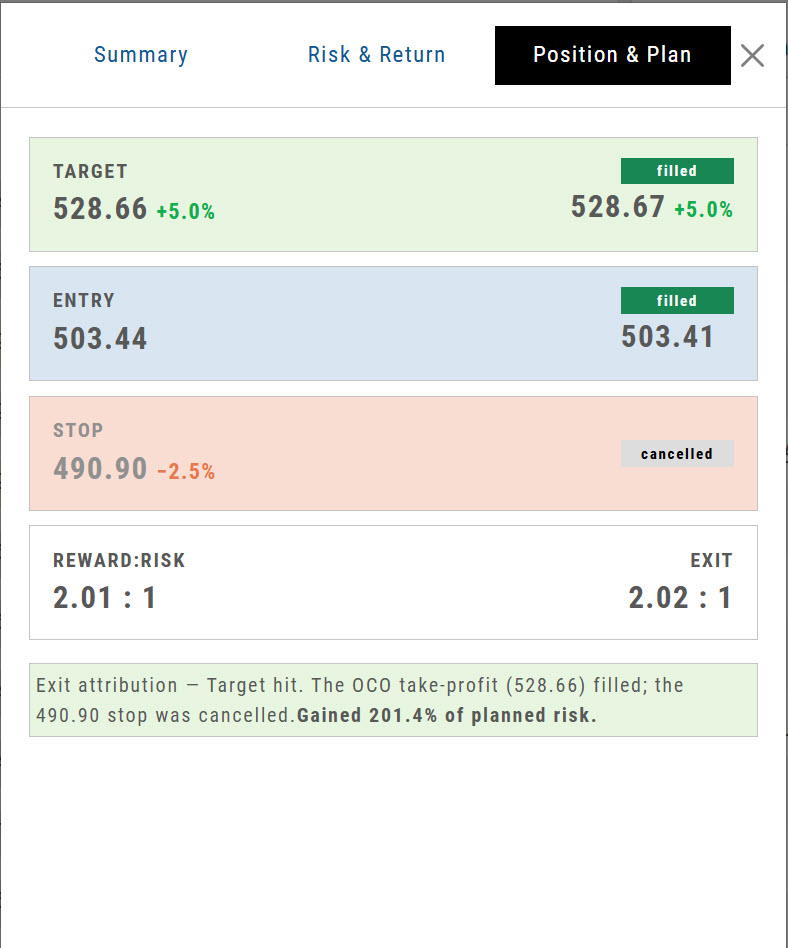
Position & Plan
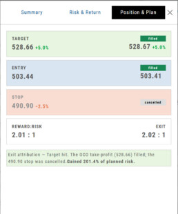
Position & Plan breaks the result down line by line — here, a better entry, a better close, and a stop that never had to fill.
Options trades
Summary · Risk & Return · Greeks & IV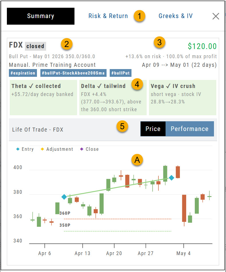
- Overview tabs — Summary, Risk & Return, Greeks & IV.
- Trade summary — symbol, trade status, position, account and tags.
- Results — Profit/Loss, % of Target and duration of trade.
- Evaluation — up to three primary drivers of the trade.
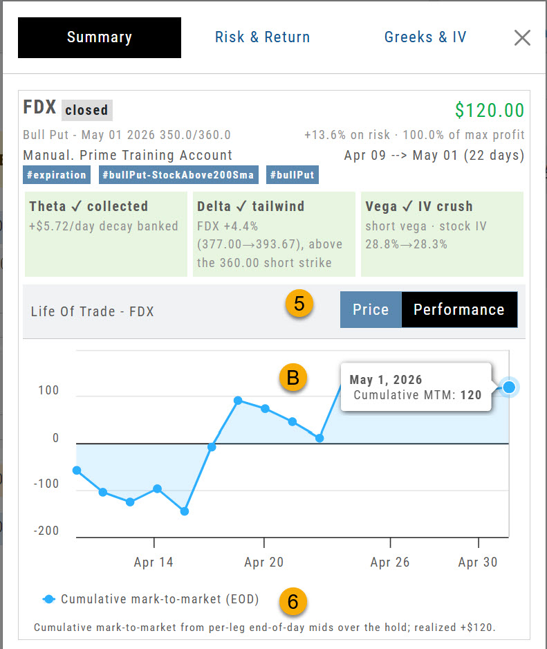
- Price / Performance — toggle between the two chart views.
- ACandlestick chart with position entry, adjustment and close.
- BCumulative activity across the trade duration.
- Summary of performance — a plain-language recap of the result.
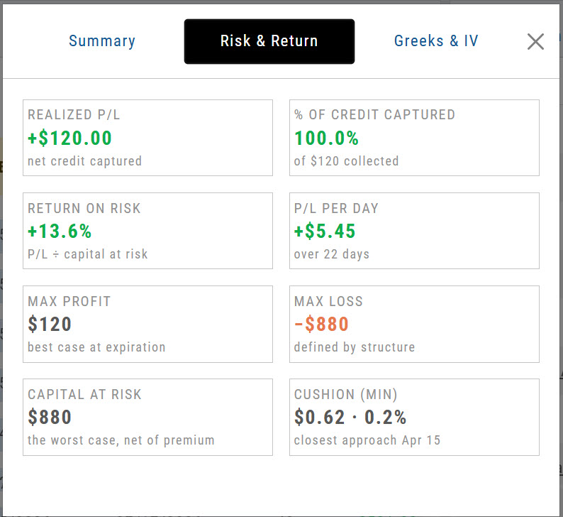
Risk & Return
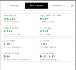
For this $10 bull put spread: max profit $120 against max risk $880, held 22 days for $5.45 per day and a 13.6% return on risk. Cushion shows how far below the break-even point the trade reached.
Greeks & IV
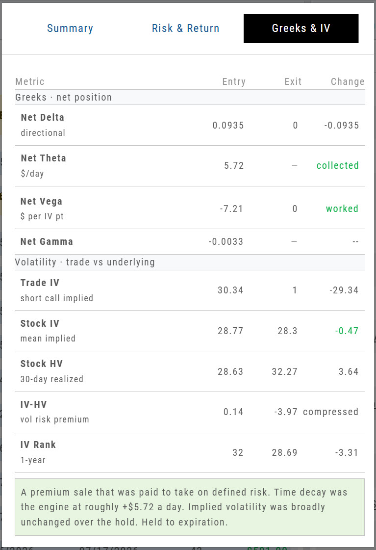
| Metric | What it tells you |
|---|---|
| Net Delta | Directional exposure — roughly what the position gains or loses per $1 move in the stock. |
| Net Theta | Premium in dollars per day that the position collects or pays for each day it is held. |
| Net Vega | What the position gains or loses per one-point change in implied volatility. |
| Net Gamma | How fast Delta itself moves as the stock moves — negative for credit spreads and short premium. |
| Trade IV | The implied volatility of your own legs — what you actually sold or bought. |
| Stock IV | The underlying's mean implied volatility, with 30-day historical volatility shown beneath it. |
| IV − HV | Volatility risk premium — how far implied sat above or below what the stock has actually been doing. |
| IV Rank | Where implied volatility sat within its own one-year range, 0–100. |
Strategy Metrics on the Option Chain
Build a multi-leg strategy on the Option Chain and the figures that decide whether it is worth taking are calculated as you go.
The callout bar sits directly beneath the legs and recalculates as you add, remove or reprice them — so you can weigh a structure before committing to it. Below it, the payoff diagram plots profit and loss across the price range, with a separate curve for each date between today and expiration.
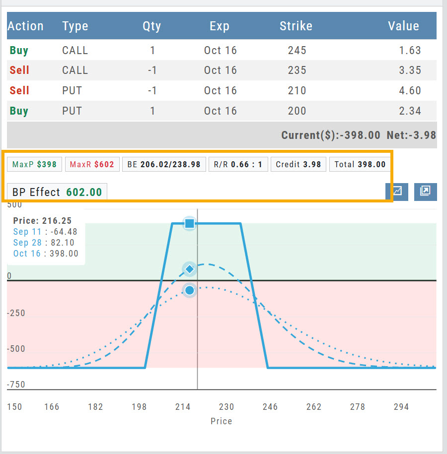
What the callout bar reports
| Field | What it shows | This example |
|---|---|---|
| MaxP | Maximum profit — the most the position can make. | $398 |
| MaxR | Maximum risk — the most it can lose. | $602 |
| BE | Breakeven price on each wing, lower and upper. | 206.02 / 238.98 |
| R/R | Reward measured against risk. | 0.66 : 1 |
| Credit | Net premium received — shown as Debit when you pay to enter. | 3.98 |
| Total | Cost to enter the trade; here, the credit collected. | 398.00 |
| BP Effect | Buying power the position ties up while it is open. | 602.00 |
Reward/Risk on the Order Ticket
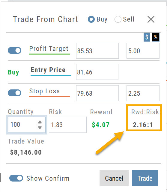
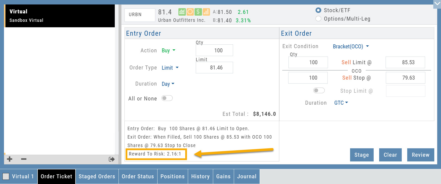
The Reward/Risk ratio you set from the chart now carries through to the Order Ticket, so it stays in view while you finalize the order.
Set it from the chart
Click Trade from the chart to set up a Bracket Order. Set a Profit Target and Stop Loss around your entry price, and the dialog reports the resulting Risk, Reward and Rwd:Risk.
Then finalize on the ticket
The Order Ticket now carries that same figure as Reward To Risk, printed with the order summary — so it stays in front of you while you review, stage or submit, rather than being left behind on the chart.
Almost Real Virtual Accounts
Built from the ground up to give you the most realistic experience possible.
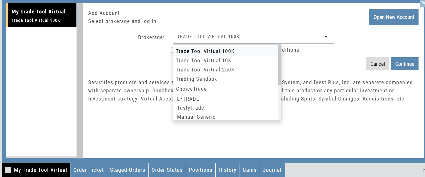
Our new Virtual Accounts are designed to make practice trading more realistic — from the moment an order fills through expiration, assignment, dividends, and margin calculations. Whether you're learning the platform, testing a strategy, or practicing before putting real money at risk, your Virtual Account now gives you a much better picture of how trades can actually affect an account.
Available starting levels: $10k, $100k and $250k.
What's great about these accounts
- Realistic Fills — fast, market-based fills with potential price improvement, even on spreads.
- Accurate Margin & Buying Power — Reg-T margin and buying power are recalculated as your positions and orders change. Margin Interest is calculated at 10% for impact when used.
- Option Expiration & Assignment — options expire, exercise, and assign as they would in a live account, including cash-settled index options.
- Dividends — eligible positions now reflect dividend activity.
- Realistic Account Outcomes — margin calls, reduced buying power, and negative equity can occur when market conditions warrant them.
Change Log
- FixedTrend Drawing Tool — adjusting a drawn trend line.
- FixedRectangle Annotation — functionality restored.
- FixedLine Cloning — thickness now carries through to the cloned line.
- FixedPrice Slices — Tab key behavior.
- FixedScan Filters — filters now clear.
- ChangedBracket Orders — now function and display as a single order on the chart.
Greeks & IV Tab Explanation
Greeks & IV Explained
The Greeks & IV tab helps you understand why an options trade performed the way it did.
Instead of showing Greeks only when you enter a trade, the Journal compares them at Entry and Exit. Think of it as a before-and-after view of your trade.
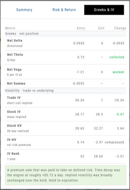
Net Delta — Direction
Delta shows how sensitive your position was to movement in the underlying stock.
- Positive Delta benefits from an upward move.
- Negative Delta benefits from a downward move.
- A move toward zero generally means directional exposure decreased.
Comparing Entry to Exit helps show whether stock movement became more or less important as the trade progressed.
Net Theta — Time Decay
Theta estimates how much the position gains or loses from the passage of time each day.
- Premium-selling strategies generally benefit from positive Theta.
- Premium-buying strategies generally pay Theta as time passes.
Rather than showing only how the daily Theta rate changed, the Journal identifies whether time decay was collected or paid during the trade.
Net Vega — Implied Volatility
Vega measures how changes in implied volatility affected the position.
- Long options generally benefit when IV rises.
- Short-premium positions generally benefit when IV falls.
The Journal summarizes whether volatility:
- Worked in your favor
- Hurt the trade
- Faded as the position approached expiration or lost remaining premium
Net Gamma — Delta Sensitivity
Gamma measures how quickly Delta can change as the underlying moves.
Higher Gamma means your directional exposure can change more quickly, particularly as expiration approaches.
For most trade reviews, Gamma provides additional context about how sensitive the position became to price movement.
Understanding Volatility
Trade IV
Trade IV is the implied volatility associated with the option contracts in your trade.
It reflects the volatility being priced into the specific strikes you bought or sold.
Stock IV
Stock IV represents the broader implied volatility of the underlying stock.
Comparing Trade IV with Stock IV can help show whether your specific options were priced with more or less volatility than the stock’s overall option market.
Stock HV
Historical Volatility (HV) measures how much the stock actually moved over the previous 30 days.
Think of it this way:
IV = expected volatility
HV = actual recent volatility
IV − HV
IV − HV compares the volatility the options market was pricing with the volatility the stock actually experienced.
- Positive: IV was higher than HV.
- Negative: HV was higher than IV.
For premium sellers, a positive difference can indicate that options were pricing in more movement than the stock had recently been delivering.
IV Rank
IV Rank shows where the stock’s current implied volatility falls within its own 1-year range, from 0 to 100.
- A higher IV Rank means volatility is relatively high for that stock.
- A lower IV Rank means volatility is relatively low.
This gives IV some context. A 30% IV may be high for one stock and low for another.
Reading the Results
The Change column helps you quickly see what happened between Entry and Exit.
Some rows show a numeric change, while Theta and Vega use words such as collected, paid, worked, hurt, or faded to make the result easier to interpret.
Colors provide another quick reference:
- Green — helped the trade
- Red — hurt the trade
- Gray — neutral or informational
A negative number is not automatically bad. For example, Delta moving closer to zero may be favorable for a short-premium trade.
Putting It All Together
When reviewing the Greeks & IV tab, ask yourself:
Did price movement help or hurt?
Look at Delta.
Did time work for or against me?
Look at Theta.
Did changes in volatility help or hurt?
Look at Vega and Trade IV.
Was volatility relatively high or low when I entered?
Look at IV Rank and IV − HV.
Taken together, these numbers help answer the most important question:
Did the trade work for the reason I expected it to?
Journal - Trade Results
Trade Details
The Journal allows you to view your trade results, including a visual outline of the position from Open to Close, including any Adjustments and Expirations.
Start in the Life of Trade view.
Click on the Gain/Loss value on the far right of the trade entry
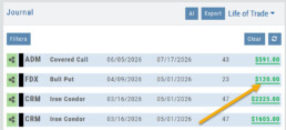
Stock Journal Entry
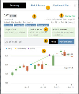
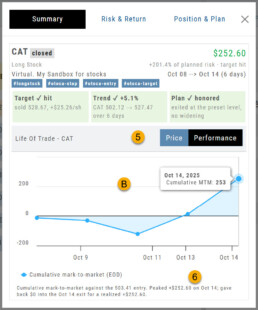
- Overview Tabs: Summary, Risk/Return, Position & Plan
- Trade Summary: Symbol, Trade Status, Position, Account & Tags
- Results: Profit/Loss, % of Target, Duration of Trade
- Evaluation: Color represents a contributing or detracting factor in the trade
- Price/Performance
A. Candlestick chart with position entry/adjustment/close – and OCO Stop/Limit, if applicable.
B. Cumulative activity for trade duration - Summary of Performance
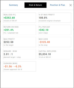
The Risk & Return Tab outlines the trade results.
In this bracket order example:
10 shares were purchased at a lower entry price ($503.41) than the order price of $503.44.
6 days later, the Target of $528.66 was reached, and the close order was executed at $528.67
The Stop Order ($490.90) was cancelled automatically.
The original plan outlined a 2.01 Reward:Risk ratio. Due to the lower entry price and higher close price, the result was a slightly higher R/R of 2.02.
The Position and Plan tab offers a breakdown of the trade results.
In this example, the stock trade was executed at a better price and reached it’s target price to close, which was also at a better price. The Stop order was cancelled.
The result shows a slightly better than expected Reward: Risk ratio
Option Journal Entry
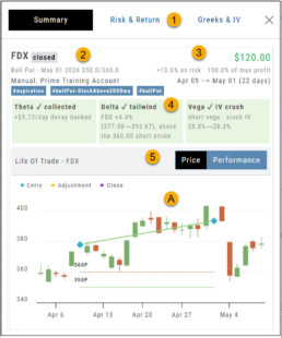
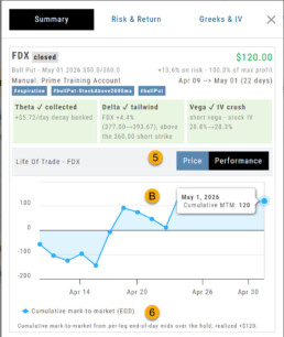
- Overview Tabs: Summary, Risk/Return, Greeks & IV
- Trade Summary: Symbol, Trade Status, Position, Account & Tags
- Results: Profit/Loss, % of Target, Duration of Trade
- Evaluation: Up to 3 Primary Drivers of the Trade
- Price/Performance
A. Candlestick chart with position entry/adjustment/close
B. Cumulative activity for trade duration - Summary of Performance
The Risk & Reward Tab summarizes the trade outline and result.
In this example:
The $10 Bull Put Spread resulted in Max Profit of $120 and Max Risk of $880
Duration: 22 days; profit per day: $5.45 ($120/22)
Return on Risk: 13.6% (120/880)
Cushion: How much below the break-even point the trade reached
| Metric | What it tells you | Change column shows |
|---|---|---|
| Net Delta | Directional exposure — roughly what the position gains or loses per $1 move in the stock | Signed number |
| Net Theta | $/day — premium the position collects (+) or pays (−) each day it’s held | collected / paid |
| Net Vega | $ per IV point — what the position gains or loses per 1-point change in implied volatility | worked / hurt / faded |
| Net Gamma | How fast Delta itself moves as the stock moves — negative for credit spreads and short premium | Signed number |
| Trade IV | The implied volatility of your own legs — what you actually sold or bought | Signed number |
| Stock IV | The underlying’s mean implied volatility, with HV (30-day historical) shown beneath it | Signed number |
| IV − HV | Volatility risk premium — how far implied sat above (or below) what the stock has actually been doing | Signed number |
| IV Rank | Where implied volatility sat in its own 1-year range, 0–100 | Signed number |
Almost Real Virtual Accounts
Realistic Trading in a Virtual Environment
Built from the ground up to give you the most realistic experience possible
Our new Virtual Accounts are designed to make practice trading more realistic—from the moment an order fills through expiration, assignment, dividends, and margin calculations.
Available starting levels: $10k, 1$00k and $250k
Whether you’re learning the platform, testing a strategy, or practicing before putting real money at risk, your Virtual Account now gives you a much better picture of how trades can actually affect an account.
Better practice.
More realistic outcomes.
More confidence when real money is on the line.
What’s great about these accounts:
Realistic Fills
Fast, market-based fills with potential price improvement—even on spreads.
Accurate Margin & Buying Power
Reg-T margin and buying power are recalculated as your positions and orders change. Margin Interest is calculated at 10% for impact when used.
Option Expiration & Assignment
Options expire, exercise, and assign as they would in a live account—including cash-settled index options.
Dividends
Eligible positions now reflect dividend activity.
Realistic Account Outcomes
Margin calls, reduced buying power, and negative equity can occur when market conditions warrant them.
26-06 Release- Bid/Ask Percent Data
Bid/Ask Spread – Premium Percentage
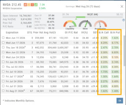
What do these columns represent?
The values represent the Bid/Ask spread percentage for the At-The-Money strike for each Expiration.
The percentage background color ranges from green, gray, yellow, and red, which represents the most liquidity to least for that ATM Expiration
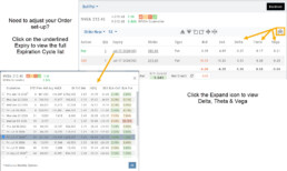
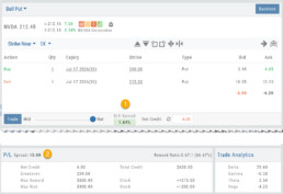
Spread Trade example:
Bull Put
1. The negotiation slider dynamically calculates the percentage of the position premium (debit or credit) that the bid/ask spread comprises when the slider is moved between the Mid (0.00%) and Natural (Max %).
2. This value confirms the Spread value. In this example, the value is 15. The strikes are 200/215:
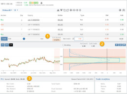
Multi-Leg Example:
Iron Condor
1. The negotiation slider dynamically calculates the percentage of the position premium (debit or credit) that the bid/ask spread comprises when the slider is moved between the Mid (0.00%) and Natural (Max %).
2. The Put/Call Premium is calculated and tied to the “Bid”.
3. The Outer legs and Body spread values.
Change Log
- ADUR display resolved
- Repaired snap quote issue with Tradier
- SPLG>SPYM display data corrected
26-06 Release Notes: Bid/Ask data
Bid/Ask Spread – Premium Percentage
What do these columns represent?
The values represent the Bid/Ask spread percentage for the At-The-Money strike for each Expiration.
The percentage background color ranges from green, gray, yellow, and red, which represents the most liquidity to least for that ATM Expiration
Change Log
- ADUR display resolved
- Repaired snap quote issue with Tradier
- SPLG>SPYM display issue corrected
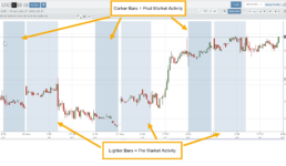
Intraday Charts displaying Pre/Post Market Activity
Intraday extended-hours charting enables users to visualize price movement beyond standard market hours, providing a more complete picture of how news, earnings, and overnight activity impact their setups. This helps reinforce timing, entries, and the real-world behavior of the markets.
Extended Trading Hours
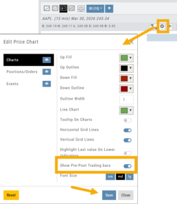
Pre and Post-Market activity can be displayed on Intra-Day charts:
First, click on the Gear icon as shown.
Then, toggle “Show Pre-Post Trading bars” to the On position, as shown.
Finally, “Save”.
Journal Auto-Reconcile
Journal Auto-Reconcile
The auto-reconciliation in the Trade Journal aligns trades and results—allowing students to focus on analyzing performance instead of managing data. Since consistent review is key to improving as a trader, this streamlines the learning process.
Start in the Reconcile View of the Journal:
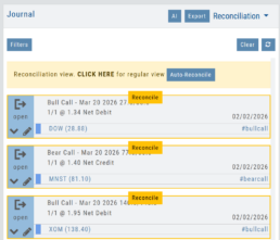
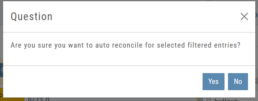
Next, click the  button.
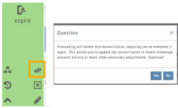
The dialog box to the left will appear:
Click “Yes”
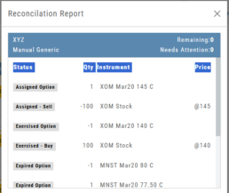
The display will list the resulting action for each expiration.
You can scroll to review.
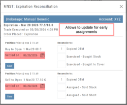
The arrow icon appears on Journal Tabs that can be edited. 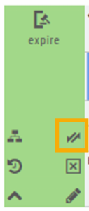
Click on the icon, confirm you want to make changes.
When completed, “Save”
The display will list the resulting action for each expiration.
You can scroll to review.
26-03 Release Notes: Journal Auto-Reconcile, Extended Trading, New Charting Indicators
Platform Release Summary
This release helps you see more of the market, spend less time tracking trades, and apply your strategies with greater confidence—with extended-hours charting, automated journal reconciliation, and new technical indicators.
Journal Auto-Reconcile
The auto-reconciliation in the Trade Journal aligns trades and results—allowing users to focus on analyzing performance instead of managing data. Since consistent review is key to improving as a trader, this feature makes the process significantly easier and more accurate
Start in the Reconcile View of the Journal:
Next, click the button.
The dialog box to the left will appear:
Click “Yes”
The display will list the resulting action for each expiration.
You can scroll to review.
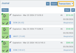
The Reconcile view will clear and all Journal Tabs will update to reflect the action resulting from each Expiration.
The arrow icon (shown) allows editing – including early assignment of options.
Note: This icon will *only* appear on Journal Tabs where the function is permitted.
Example: Stock Positions will not display the icon.
Extended Trading Hours
Pre and Post-Market activity can be displayed on Intra-Day charts:
First, click on the Gear icon as shown.
Then, toggle “Show Pre-Post Trading bars” to the On position, as shown.
Finally, “Save“.
Additions: New Charting Indicators
Chande Momentum Indicator (CMO)
Measures the strength of price movement by evaluating both gains and losses, providing a more balanced view than traditional oscillators.
- Above +50: Indicates overbought conditions (potential selling opportunity)
- Below -50: Indicates oversold conditions (potential buying opportunity)
Summary: Helps identify when price movement may be overextended and due for a reversal.
Chaikin Money Flow (CMF)
An oscillator measuring buying and selling pressure by analyzing money flow volume over a set period, rather than cumulatively.
- Positive values: Indicate buying pressure (accumulation)
- Negative values: Indicate selling pressure (distribution)
- Default setting: 20-period (typically 20 days)
Summary: Helps identify whether money is flowing into or out of a security over a defined timeframe.
Directional Movement Index (DMI)
A trend indicator that measures both the direction and strength of a trend using three lines: ADX, +DI, and -DI.
- +DI above -DI: Indicates an uptrend
- -DI above +DI: Indicates a downtrend
- ADX: Measures trend strength (regardless of direction)
- Default setting: 14-period
Summary: Helps identify trend direction and the trend’s strength
Ultimate Oscillator
A momentum indicator that combines three timeframes to provide a more balanced view of market strength and reduce false signals.
- Higher values: Indicate stronger buying pressure
- Lower values: Indicate stronger selling pressure
- Used to identify overbought/oversold conditions and potential trend reversals
Summary: Helps confirm momentum and spot potential turning points with greater reliability.
Change Log
- Improve OHLC appearance
- Repair drawing annotations on extended chart
- Reconciliation mode functionality fixed