Research Your Watchlists
Research Watchlist Functionality
Users are able to access all Watchlists from the Research Tab.
Click the ![]() to access the dropdown list as shown in the graphic.
to access the dropdown list as shown in the graphic.
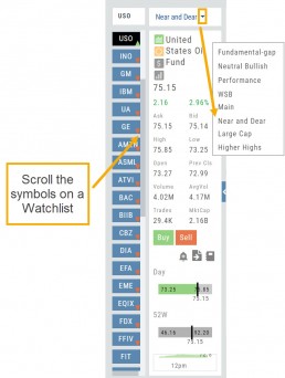
Lists with more than 20 symbols will have a scroll bar allowing for easier research of larger lists.
All other functionality remains the same: Symbols can be moved to other lists, have alerts set, deleted, add Journal notes
When a symbol is entered in the Symbol Search Box on the Research Tab, the symbol will automatically be displayed on the default “Recents” list.
In addition, when a symbol or group of symbols is sent to Research from anywhere else on the platform, it will appear on a list under the default “Recents” list.
Examples of when the “Recents” list will be displayed:
- Sending a symbol/symbols from a list on a Watch Tab.
- Selecting a group of symbols from a Scan or Screener list.
- Clicking on the Technical Icon from any symbol when not in the Research Tab. will be displayed under “Recents”.
The functionality of adding a note, an alert or sending a symbol to a specific list remains the same.
Platform Features Release: October 2022
Announcing the latest Release of feature and functionality enhancements to the trading platform. These features and enhancements help keep users informed with activity on their trades. Functionality has been added to review a Watchlist in the Research tab, while being able to see at a glance which symbols have a price increase or decrease.
Notifications – Receive emails on upcoming Earnings, Dividends or Expiring Positions
Watchlist Research Functionality – Access and view your Watch Lists in the Research Tab via a drop-down box
Price Action Arrows on Symbols in Research Tab – Instantly see latest price action while on the Research Tab
Trade Position Notifications – Premium Feature
Want to receive weekly emails of Expiring Positions, Upcoming Earnings and/or Dividends on existing trades you have in your accounts?
This Premium Feature allows you to do just that in a 2-part process:
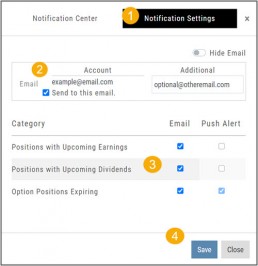
First: Click on the the Envelope Icon at the top of the platform screen:
![]()
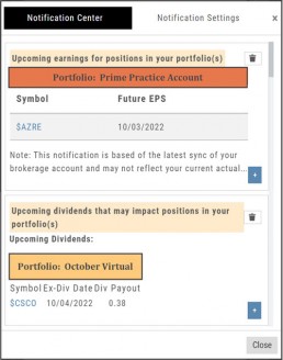
Go to “Notification Settings.”
Provide your email address(es).
Select Notifications you want to receive.
Click “Save”.
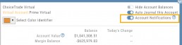
Next: On your Portfolio Accounts, go to the Account Summary Page and Toggle the switch to the On position.
Repeat this process for each Account you want emailed Notifications.
Expiration Notifications will be emailed 2 days in advance.
Each Monday, prior to Market Open, an email will be sent where there’s an Earnings or Dividend for any of the positions in the account(s) you have activated.
The Notification Center will list what has been emailed to you for each account you have activated.
The Account Name and associated Color Tag will be displayed on each Notification and allows for quick identification.
Each Monday, prior to Market Open, an email will be sent where there’s Earnings or Dividend for any of the positions in the account(s) you have activated.
The Notification Center will list what has been emailed to you for each account you have activated.
The Account Name and associated Color Tag will be displayed on each Notification and allows for quick identification.
Research Watchlist Functionality
Users are able to access all Watchlists from the Research Tab.
Click the ![]() to access the dropdown list as shown in the graphic.
to access the dropdown list as shown in the graphic.
Lists with more than 20 symbols will have a scroll bar allowing for easier research of larger lists.
All other functionality remains the same: Symbols can be moved to other lists, have alerts set, deleted, add Journal notes
When a symbol is entered in the Symbol Search Box on the Research Tab, the symbol will automatically be displayed on the default “Recents” list.
In addition, when a symbol or group of symbols is sent to Research from anywhere else on the platform, it will appear on a list under the default “Recents” list.
Examples of when the “Recents” list will be displayed:
- Sending a symbol/symbols from a list on a Watch Tab.
- Selecting a group of symbols from a Scan or Screener list.
- Clicking on the Technical Icon from any symbol when not in the Research Tab. will be displayed under “Recents”.
The functionality of adding a note, an alert or sending a symbol to a specific list remains the same.
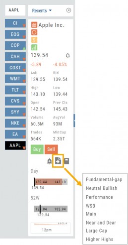
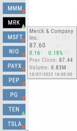
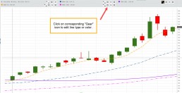
Green and Red Arrows have been added to each symbol tab when in Research.
This applies to any selected Watchlist or the default “Recents” list.
Each time one symbol is clicked, the entire list will update the latest price update.
Change Log
- Upper Indicator responsiveness corrected
- Profitability info loads correctly on Fundamental Tab
- Completed Bear Put description on Strategy Template
- Corrected display data on Fundamental Tab
Platform Features Release: August 2022
Announcing the latest Release of feature and functionality enhancements to the trading platform. These allow for more customizing ability and streamlines functions on accessing or displaying information. Highlights include:
Screen for Weekly Options – The ability to screen for weekly options has been added to the Screen Function under Find.
Rearrange Screener Data Points – Change selection order directly on the Results page, by drag/drop action.
Large Chart Widget on Custom Page –The new widget fits an entire row on the custom page.
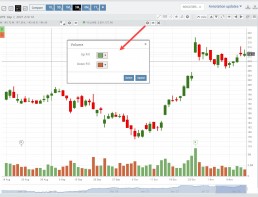
Customize Moving Averages – The Moving Average thickness can now be customized.
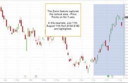
Vertical Zoom on Chart – Function expanding to allow for Horizontal and Vertical Zoom.
Double-click function on Expiration Cycle Page –Eliminates need to click “Okay” button
Screen for Weekly Options
The Screener – located under the Find Tab – now provides the ability to screen for Weekly Options.
Now customizing your own searches is even better!
Remember, you can save Screens for future use – and even edit/update them as needed.
Rearrange Screener Criteria
Rearrange Screener data points on the Results page by clicking ![]() located on the upper left corner of each data point, then drag up/down.
located on the upper left corner of each data point, then drag up/down.
The data points are filtered with each entry in the order they are listed.
Additional edits can be made with the existing Screener data points:
Click ![]() to keep the data point but disregard in an updated “Run Search”.
to keep the data point but disregard in an updated “Run Search”.
Click ![]() to remove the data point from an updated “Run Search”.
to remove the data point from an updated “Run Search”.
Save to keep the edited Screener for future use.
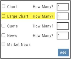
Large Chart Widget on My Custom Page
An individual chart can be set on an entire row on the Custom Page by selecting the Large Chart widget.
The Custom Page set-up and arrangement remain the same.
Customize Moving Average Lines
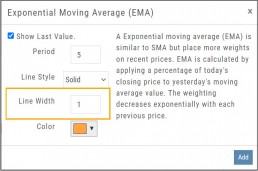
All Moving Average Indicators, Exponential, Simple, Triangular and Weighted can be customized to set Line Width. The default setting is ‘1’.
This update, along with previously added, user-defined “Line Type” allows for even more identification in charting analysis.
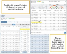
Expiration Cycle Double-click Functionality
Quickly access one or more Expiration Cycles by double-clicking on each row you wish to evaluate.
The selected dates will automatically display on the Chain.
Click “Expiration Cycles” button again to revise/add to existing cycles.
Vertical & Horizontal Zoom Functionality
Change Log
- Corrected “Extend By” behavior on Chart with Streaming
- Created ability to reconcile partial trades
- Updated Annotation editing capability when adding text
- Resolved Edge browser/Annotations conflict
- Volatility Stop Indicator – expanded
- Fixed navigation break: Chain>Chart>Chain
- Analyze function restored on certain strategies
- Alert tool-tip correction
- Adjusting Parallel lines now saving
- Corrected Pending/Executed Order on Chart display
Platform Features Release: April 2022
Announcing the updates, additions and edits to the trading platform:
Capability to adjust charts for splits
When a stock had a previous stock split, a button appears above to view Adjusted/Unadjusted Chart.
Data Points added to Option Chain
Get % return on Expiration and annualized % values for covered positions.
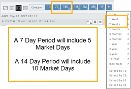
Intraday Chart Period Update
1 Week displays as 7 Days. 2 Weeks displays as 14 days.
Chart Adjusts for Splits
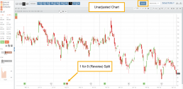
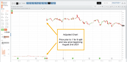
When a stock has a Split history, ![]() will appear next to the Indicator Box above the chart.
will appear next to the Indicator Box above the chart.
Make sure the chart period selected covers when the split occurred. This is identified on the x-axis of the chart as ![]() .
.
When the “UnAdj” button is clicked, the chart will display ‘before’ & ‘after’ split pricing.
Click the “UnAdj” button again to restore the prior chart display.
New Option Data Points Added
New data points have been added to assist in analyzing returns.
Covered Return – return based on expiration for $ used to buy shares for covered positions.
TVI% – Covered Return annualized
These are available on the Calls/Puts Chain and are also available as data points for Option Chain Custom Views
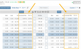
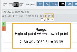
Chart Enhancements: Chart Periods & Candlestick Range
Change Log
- Resolved Saved Screener settings glitch
- Corrected Backtest Analyze date ability
- Restored sort capability in Institutional Activity
- Corrected profit/loss % display in Virtual Accounts
- Restored missing PEG/TTM data
- Enhanced contrast/dark theme notation
- Corrected Virtual Account Gain/Loss display
- Lower Indicator placement ability restored
- Earnings Data restored, added Time of Day
- Duplicate TDA Journal tab resolved
Platform Features Release: Enhanced Annotation Capability and Indicator Settings
Announcing the latest features/functions updates, additions or edits to the trading platform:
Enhanced Annotation Capability
Additional features have been added to create Annotations, Trendlines and Notes on the Chart. Each can be customized by color, size and easily placed on individual charts.
Volume and Moving Average Indicator Updates:
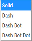
Users have the ability to further differentiate Moving Averages on the charts by changing the type of Line.
Volume can now be selected as an Upper Indicator and/or Lower Indicator
Enhanced Annotations, Trendlines, Notes & Fibonacci capabilities
Additional & Enhanced Tools for Charting
Enhanced Annotations, Trendlines, Notes & Fibonacci Retracements allow you to customize and edit for greater flexibility on your charting.
Rays, Horizontal Lines and Arrows have been added. All allow you to select the color and thickness of each for greater differentiation on the charts. Easily reposition with a simple click and drag to new location.
Notes can be text and color edited as well as repositioned.
Parallel Lines have been added and they, along with Fibonacci Retracements – allow you to customize the color and transparency on the charts.
Edits are easy: Click on the entry, edit as needed on the Annotation Box – which can be moved anywhere on the platform- as needed, to make any changes.
Volume and Moving Average Enhancements
Customize your Moving Average indicator Lines – not only by color – but by the type of line:
Volume, already available as a Lower Indicator, can be added as an Upper Indicator on the charts.
In addition, the Volume bar colors can be customized as they are an independent indicator from the candlesticks. This is done by clicking on the gear icon, as shown.
Change Log
- Added Stock/ETF symbol to Option Chain Window
Platform Features Release: New Option Chain Functionality/Appearance, Responsive P/L Graph
Features Release Notes:
New Option Chain Functionality/Appearance, Responsive P/L Graph
Announcing the latest features/functions updates, additions or edits to the trading platform:
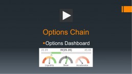
Option Chain Functionality/Display has been revamped to allow users to control which information to view and increase responsiveness. Symbols, such as SPY and SPX, will load noticeably faster. An incorporated Dashboard provides a snapshot of current activity allowing users to make more informed decisions.
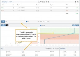
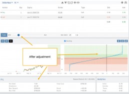
Responsive P/L Graph adjusts when the slide bar between Bid and Mid price is adjusted. This is especially helpful when the spread is considerable.
Option Chain Display/Functionality
Select Expiration Cycles
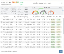
The redesigned Option Chain allows users control of what Expirations to view instead of the platform defaulting to a cycle approximately 30 days out.
Click on the Options Tab from Research.
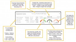
A window with available Expirations will appear along with a Dashboard with pertinent information (Volume, IV, OI, Earnings Date, etc) for more informed decision-making.
As a bonus, this structure allows data to load faster – especially helpful for those symbols with large option chains.
Responsive P/L Graph
The P/L graph on the Options Tab is responsive to adjustments made to the trade set up for the entry Net Debit/Net Credit.
Note, the smaller the spread between the Bid/Ask, the smaller the graph adjustment will be.
The example illustrates a large spread to better illustrate this feature update.
Change Log
- Price representation on chart X/Y axis corrected
- Journal Notes enhancement
- Saved screeners adjustment
- Active Watchlist access corrected
- Close from Backtest saves Symbol
- Clarified wording on Warning Message
- Mobile version of Saved and System Screener
- Mobile app – rolling trade adjustments
- P/L ‘Go Big’ data correction
- Account Summary page enhancement
- Large number displays on HeatMap
Option Chain Functionality
Option Chain Video
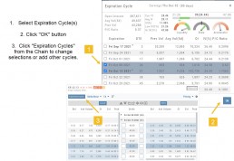
Research>Option Tab, click on “Expiration Cycle” for the “Call+Put”, “Calls” or “Puts” view.
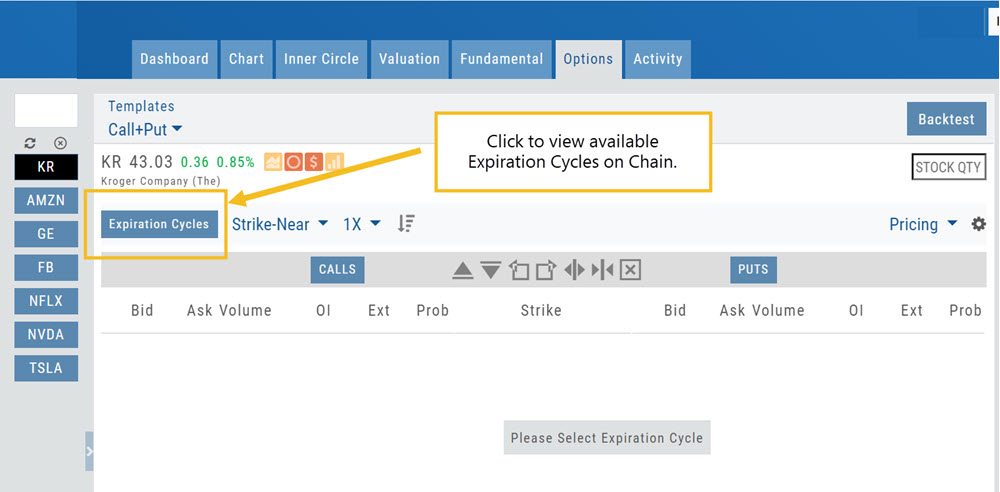
Option Chain Expiration Cycles
The Option Chain Expiration Table gives you control of selecting which Expiration Cycle(s) you want to view.
The Option Dashboard provides a wealth of pertinent information to make informed decisions easier.
See below for more detail
Expiration Cycles: All available options will be displayed. Monthly Options are indicated with an asterick![]()
Select Expiration Cycles
Click ‘OK”
Chain will display for selected
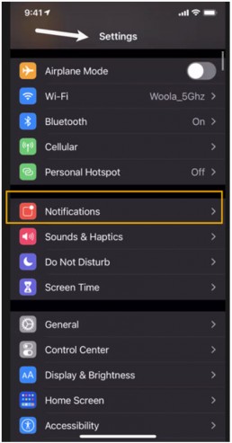
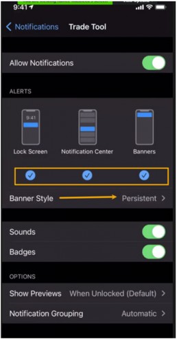
Enabling Notifications
Below is a general guide to enabling Notifications on your Desktop/Laptop and Mobile devices.
Please note: Settings/Configurations vary by device. It is important for you to be familiar with your system/device. When in doubt, refer to the Help function on your computer/phone. An internet search of ‘How do I…” for your device is also helpful.
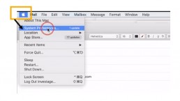
Macs
- Open the Apple Menu
- Select System Preferences
- Select Notifications
- Select Browser
Hint: While on the platform, click on the Lock Icon in the browser bar to check status of/enable notifications.
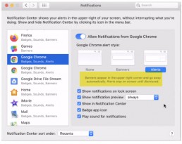
Customize how you want Notifications to display.
- Allow from Browser
- Banners or Alerts
- Allow Sound
- Sort functions – how often, when, what, etc.
iPhone/iPad
Follow illustrations: Settings>Notification>App>Customize
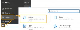
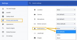
PCs
- Click the Windows Icon to access PC Menu
- Select Settings>System
- Select “Privacy & Security” on the next window
- Under “Notifications”, select either “Allow” or “Ask”
Hint: While on the platform, click on the Lock icon in the browser to check the Notification status
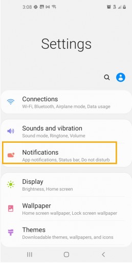
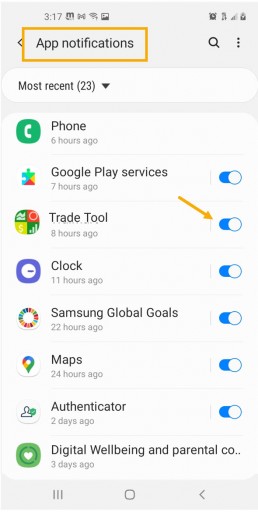
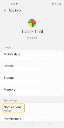
Android/Tablets
Follow illustrations: Settings>Notifications>Apps>Customize/Manage
Platform Feature Release: Screener
Feature Release Notes: Screener
Announcing the latest feature/function updates, additions or edits to the trading platform:
Screener – Trading styles are unique. Screener, the platform’s newest feature allows for customized opportunity searches. Differing from Scans, which are predefined, Screener offers over 120 data points for customize searches based on what the user’s goals are. Additional data points will be forthcoming.
Screener searches may be saved and named for the user’s future use. In addition, System Screeners are available as starting point templates for the user to customize and save as personal Screeners.
Screener
Located under the Find Tab, the Advanced Screener is designed to allow the user to customize their own trade candidate searches. Over 125 criteria selections are available – with more to follow.
Screener is flexible – allowing you to create save as many Screen searches as you wish, edit as needed, even download results.
Screens are user-defined, 100% customized by the user’s specifications. They can be edited, saved and deleted.
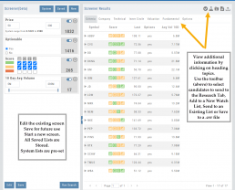
Left Control Panel
New – Create a new screener
Saved – Previously created and saved screens. Saved screens can be edited for a single-use or saved as a new screen or overwriting the previously saved screen
System – Templates available for use as starting points for new screeners. While the System screens themselves cannot be modified, they can be used as a foundation for newly created screens that – can be modified for personal use and saved.
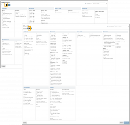
Select your Criteria
There are 3 Levels of Data. Currently Level 3 mirrors Level 2 – as more criteria will be added to this feature.
Level 1 offers Basic Information to select from. Level 2 expands upon what Level 1 offers.
After choosing your criteria, you’ll be able to set the parameters for each criteria selection on the next screen.
Click “Run Search”
Note: The order the criteria is selected, will be the order the selections are displayed on the next screen.
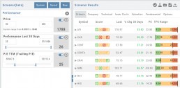
The Results
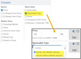
The criteria selected in this example were Price ($50-200), Optionable, Score (Green or Yellow for each Icon) and 10-day Average Volume (5M-293M) resulting in 17 candidates.
From here, using the Icon Toolbar, candidates can be selected and:
- Sent to Research for further analysis
- Sent to an existing Watch List
- Used to create a New list
- Can be download to a .csv file.
The Screen itself can be Saved (and named), further modified -either by
adjusting the existing criteria or adding new datapoints – or a New Screen
can be created.
Additional data is accessible by clicking on “Company”, “Technical”, etc
above the list of candidates.
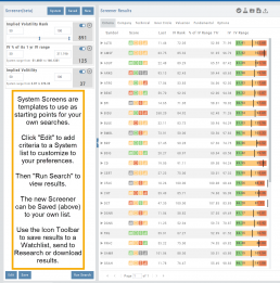
System Screens are also available and new ones will be added.
The user can customize such screens and save to the platform just as any other
screen.
Candidates can be sent to Research, to a Watch List and/or
downloaded to a .csv file.
System Screens themselves cannot be modified and are designed to be
‘launching points’ for the user’s convenience if they wish to use them.
Note the colored bar graph of IV Range. It provides a ‘picture’ of where this
Stock/ETF is now for this datapoint.
Change Log
- TTM Squeeze Indicator added
- Option Chain column line up
- Double scroll bars appearing in Safari/Screener
- Split notification on Chart added
- Staged Order behavior -data loading resolved
- Trade Button appearance on Chart from Staged
- Industry Link responsive
- Mobile – corrected Stage Button function on Stock Order Ticket
- Mobile – updated “Save” Alert functionality
- Mobile – adding Indicator (Android) corrected
- Earnings < 7 days are noted in red
Screener (Premium Desktop Feature)
Screener
Located under the Find Tab, the Advanced Screener is designed to allow the user to customize their own trade candidate searches. Several hundred data points are available to select from, build your Screen, Save for future use and Edit as needed.
Screener is flexible – allowing you to create save as many Screen searches as you wish, edit as needed, even download results.
Screens are user-defined, and 100% customized to the user’s specifications. They can be edited, saved, and deleted.
Left Control Panel
New – Create a new screener
Saved – Previously created and saved screens. Saved screens can be edited for single use, saved as a new screen, or to overwrite the previously saved screen
System – Templates available for use as starting points for new screeners. While the System screens themselves cannot be modified, they can be used as a foundation for newly created screens that can be modified for personal use and saved.
Select your criteria
There are 3 Levels of Data.
Level 1 offers Basic Information to select from. Level 2 expands upon what Level 1 offers. Level 3 offers all available, in-depth selections.
After choosing your criteria, you’ll be able to set the parameters for each criteria selection on the next screen.
Click “Run Search”
Note: The order the criteria are selected, will be the order the selections are displayed on the next screen.
The Results
The criteria selected in this example were Price ($50-200), Optionable, Score (Green or Yellow for each Icon), and 10-day Average Volume (5M-293M) resulting in 17 candidates.
From here, using the Icon Toolbar, candidates can be selected and:
- Sent to Research for further analysis
- Sent to an existing Watch List
- Used to create a New list
- Can be downloaded to a .csv file.
The Screen itself can be Saved (and named), or further modified – either by
adjusting the existing criteria or adding new data points – or a New Screen
can be created.
Additional data is accessible by clicking on “Company”, “Technical”, etc
above the list of candidates.
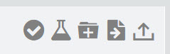
Icon Tool Bar – Hover Cursor over Icon to view function
Select one or more symbols
Send selections to Research
Create a New Watchlist with Selected Candidates
Send Candidate to an Existing Watchlist
Download to .csv file
System Screens are also available and new ones will be added.
The user can customize such screens and save to the platform just as any other
screen.
Candidates can be sent to Research, to a Watch List and/or
downloaded to a .csv file.
System Screens themselves cannot be modified and are designed to be
‘launching points’ for the user’s convenience if they wish to use them.
Note the colored bar graph of IV Range. It provides a ‘picture’ of where this
Stock/ETF is now for this datapoint.
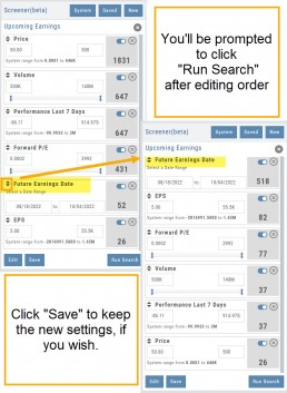
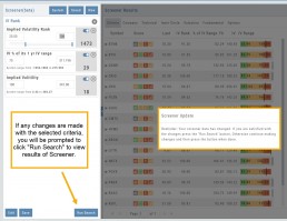
Edit Screeners
Edit current, Saved or System Screeners by adjusting parameters of existing criteria using the slide bars, entering values in boxes, etc.
A Screener Update notice will appear prompting you to select “Run Search” after adjustments are completed. Updated results will populate the left table.
From here, use the Icon Toolbar for further options: Select, Add to Watchlist, Research or Download.
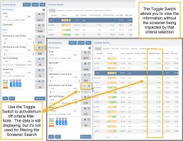
Toggle Criteria
The Toggle feature gives you additional flexibility in your Screener searches.
The ON position includes the selected criteria in calculating results.
The OFF position for that criteria will not affect the results when used to filter results. However, that data column will still be displayed with the other points selected.