Market Overview: Get more of a broad view
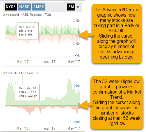
View activity of the NYSE, Nasdaq or American Stock Exchange by time frame. The upper area of this part of the Market Tab shows the number of advancing or declining stocks by sliding your cursor along the graph.
Likewise, the bottom portion of shows the number of stocks that reached their 52-week High or Low by sliding your cursor along the lower graph.
The constant figures show the number of stocks in each category for the current/most recent trading day.

Advanced/Declined & Highs/Lows
The Graphs on the left side of the Market page can provide confirmation of whether there was a Rally or Sell-Off in the time frame selected by providing the numbers of stocks taking part in of the movement.
The 52-week High/Low Graph further confirms if there is a Market Trend by showing how many stocks closed at their 52-week High/Low.
Note, you can select a 1, 3 or 6 Month or 1 Year time frame in which to view the data. By sliding the cursor along the horizontal ‘0’ (zero) line on each graph, data for each day will appear.
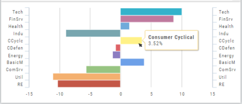
Industry Performance Bar Chart
The Bar Chart is located on the Market Tab and updates dynamically with selected Heat Map Index and Time Frame. This provides an additional view of the overall Market by Industry. Below is a 3 month Heat Map/Bar Chart view of the S&P 500. The bottom Bar Chart shows a 6 month view.
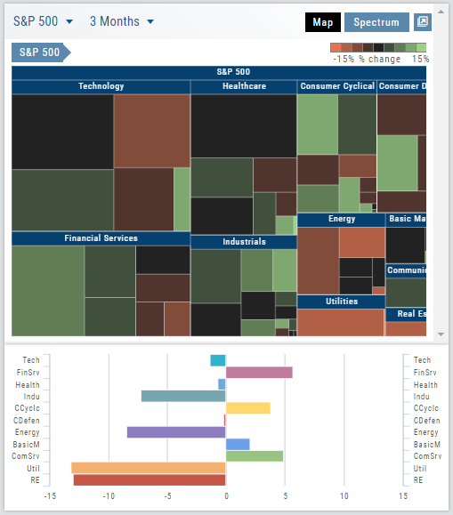
Each Industry is represented by a unique color and are listed by Market Cap – largest on top to the smallest at the bottom. Hover your cursor over each bar for the Industry name and % change of the selected time period to appear.
The center of the Chart is Neutral and will appear blank just prior to the Market’s Opening Bell. Bars extending right of center represents Gains, left of center represents a Loss for the time period selected on the Heat Map.
Snapshot: Comparing Positions
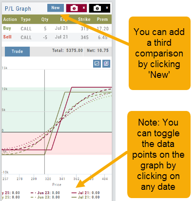
The Snapshot feature gives you the ability to compare up to three scenarios in one view without having to change screens or erase previous setups. You can even submit a trade from this part of the platform!
- From the Calls+Puts chain (as well as “Calls” or “Puts”) enter the initial trade position.
- Next click one of the camera icons:
- Repeat the first step using the Rolling Icons to adjust the initial position to a new scenario:
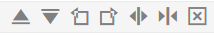
- Click the 2nd camera icon & repeat the above steps for the last trade comparison.
Note: The position lines are color coded to match the Snapshot (or New) icon.
Once you decide on the optimal position, click ‘Trade’ from the P&L Graph and you’ll be taken to the Order Ticket of your brokerage account with the option information auto-filled. 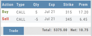

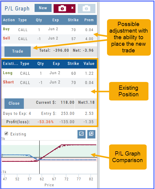
Trade Management
This platform makes it easy to manage and adjust trades when needed. The Snapshot feature and the P/L graph enables you to visually assess adjustments.
Once the existing trade is showing on the options page, take a ‘snapshot’. Enter the adjustment, then take another ‘snapshot’.
To submit the adjustment to the Order Ticket of your brokerage account, click “Trade”. The smart ticket system will even handle the trade adjustment automatically by entering the appropriate buy/sell, open/close combination. 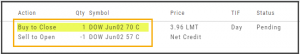
Use SNAP to Backtest Positions
The Snapshot feature is also available with Backtesting.
- Click ‘Backtest’ on the Option Table
- Set up position
- Click one of the camera icons:
- Repeat the first step using the Rolling Icons to adjust the initial position to a new scenario:
- Click the 2nd camera icon & repeat the above steps for the last comparison.
- Select the ‘Analyze Date’ using the Date Picker (Calendar) or “EXP” to analyze the position on Expiration Date.

