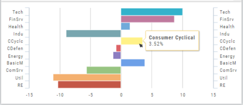
The Bar Chart is located on the Market Tab and updates dynamically with selected Heat Map Index and Time Frame. This provides an additional view of the overall Market by Industry. Below is a 3 month Heat Map/Bar Chart view of the S&P 500. The bottom Bar Chart shows a 6 month view.
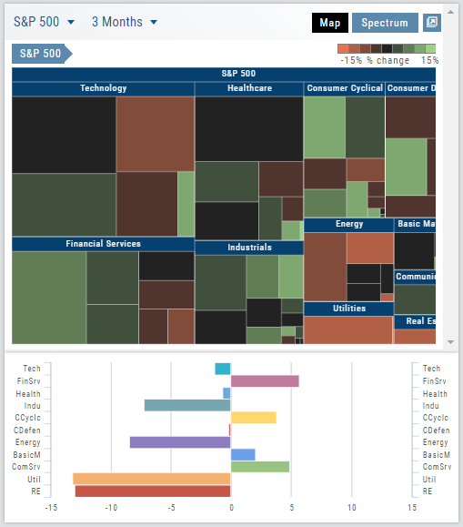
Each Industry is represented by a unique color and are listed by Market Cap – largest on top to the smallest at the bottom. Hover your cursor over each bar for the Industry name and % change of the selected time period to appear.
The center of the Chart is Neutral and will appear blank just prior to the Market’s Opening Bell. Bars extending right of center represents Gains, left of center represents a Loss for the time period selected on the Heat Map.