Market Overview: Get more of a broad view
View activity of the NYSE, Nasdaq or American Stock Exchange by time frame. The upper area of this part of the Market Tab shows the number of advancing or declining stocks by sliding your cursor along the graph.
Likewise, the bottom portion of shows the number of stocks that reached their 52-week High or Low by sliding your cursor along the lower graph.
The constant figures show the number of stocks in each category for the current/most recent trading day.

Heat Maps Too
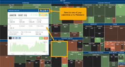
The Heat Maps on the Market page offer the ability to drill down to the stock level. You are able to do this with both the Map and Spectrum views. Clicking on a stock will also show the quote detail. From this you can also send to a list or research.
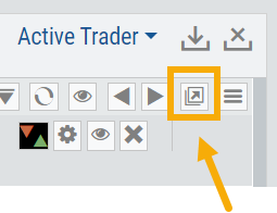
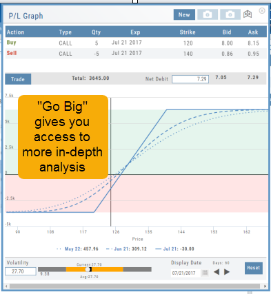
Go Big - Graphs & Charts
Anywhere you see the ‘Go Big’ icon ![]() , you can expand the graphic and access additional information.
, you can expand the graphic and access additional information.
The Chart Tab under Research has such a button in the icon toolbar as shown:
The Heat Map on the Market Tab will allow you to filter criteria such as stock price, volume, market cap, etc. 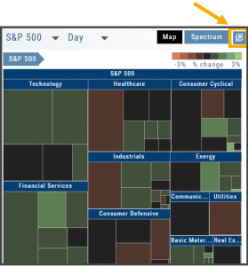
In the Options Tab, you can do this with the P/L Graph and the Volatility Chart. The icon is located at or near the upper right of the graph or chart.
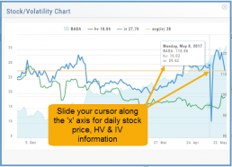
Expanding the Stock/Volatility Chart allows you to view past Historic Volatility, Intrinsic Volatility and stock price on a day-to-day basis.
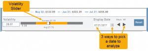
For deeper Trade Analysis, use the Volatility Slider tool and the Date Picker, located at the bottom of the P&L Graph:
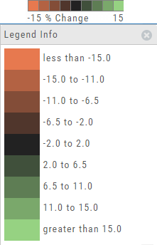
The Legend - Heat and Spectrum Maps
The Legend shows the range of % negative or positive change represented by a color spectrum. It is important to note: the range does adjust according to the data filters you select for the Heat or Spectrum Maps.
Clicking on the legend will show specific range of each color in the spectrum and give additional information about the definition.
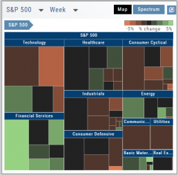
Heap Map View
Each box in the Map View represents either an industry group or a stock when you drill down. The size of the box represents the market cap. 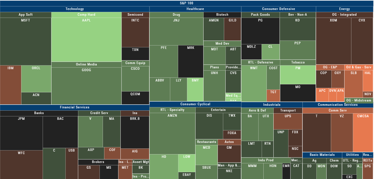
The color represents the data displayed (default : % change) for the time frame selected.
In the Market Tab, select the ‘Go Big’ option in Heat Map for more detail.
You have the capability to adjust your Map based on Stock Price, Average Volume, Market Cap and % Change.
Bonus: The platform will remember your filters until you reset them during the current session.
52 Week High/Low Value
The 52 Hi/Low Value represents the current percentile of the stock (or sector) relative to it’s 52 week 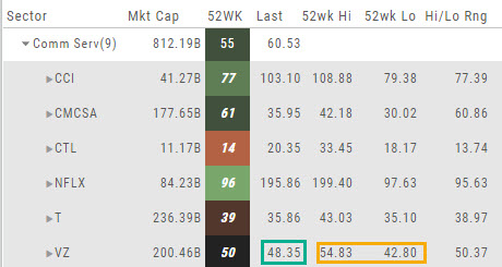 high/low price range. The Sector Value is the average of stocks within that sector.
In the Communication Services example, the average for the Sector is 55. When expanded, we see Netflix (NFLX) is near the top of it’s 52-week range at 96. Centurylink (CTL) is closer to the low end of it’s range at 14. Verizon’s current price is in the middle of the High-Low range.
This information is also available on the Map View but hovering your cursor over a stock tile while in 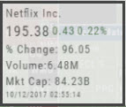 the 52 Wk Hi-Low View. Netflix shows the stock is at the 96th percentile of it’s high-low range.
Remember, you can refer to the Legend (found in the upper right part of the screen) for defined range values for any criteria view you select.
Explore - Give it a try!
From finding the best stock in the best sector to following where the money is flowing to and from, Heat Maps (and Spectrum, too!) offer insight both interesting and valuable.
Drill down for bullish, bearish and stagnant opportunities.