Each box in the Map View represents either an industry group or a stock when you drill down. The size of the box represents the market cap. 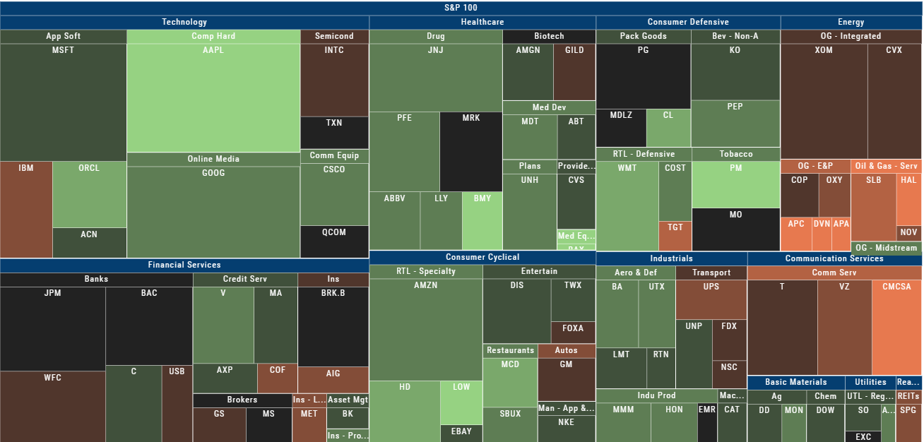
The color represents the data displayed (default : % change) for the time frame selected.
In the Market Tab, select the ‘Go Big’ option in Heat Map for more detail.
You have the capability to adjust your Map based on Stock Price, Average Volume, Market Cap and % Change.
Bonus: The platform will remember your filters until you reset them during the current session.