Platform Features Release: Economic Dashboard, Chart Adjustment, Chart Time Period
Announcing the latest Release of feature and functionality enhancements to the trading platform to improve the investment/trading decision process.
Economic Dashboard: View chart data from dozens of economic reports. Includes information on why it is important, what to look for, and how to apply the data to trading.
Chart Adjustment: Ability to compress and expand y-axis.
Chart Periods: New look, improved functionality.
Economic Dashboard
Located under the Home/Market Tab, this powerful research tool provides important economic information in chart format.
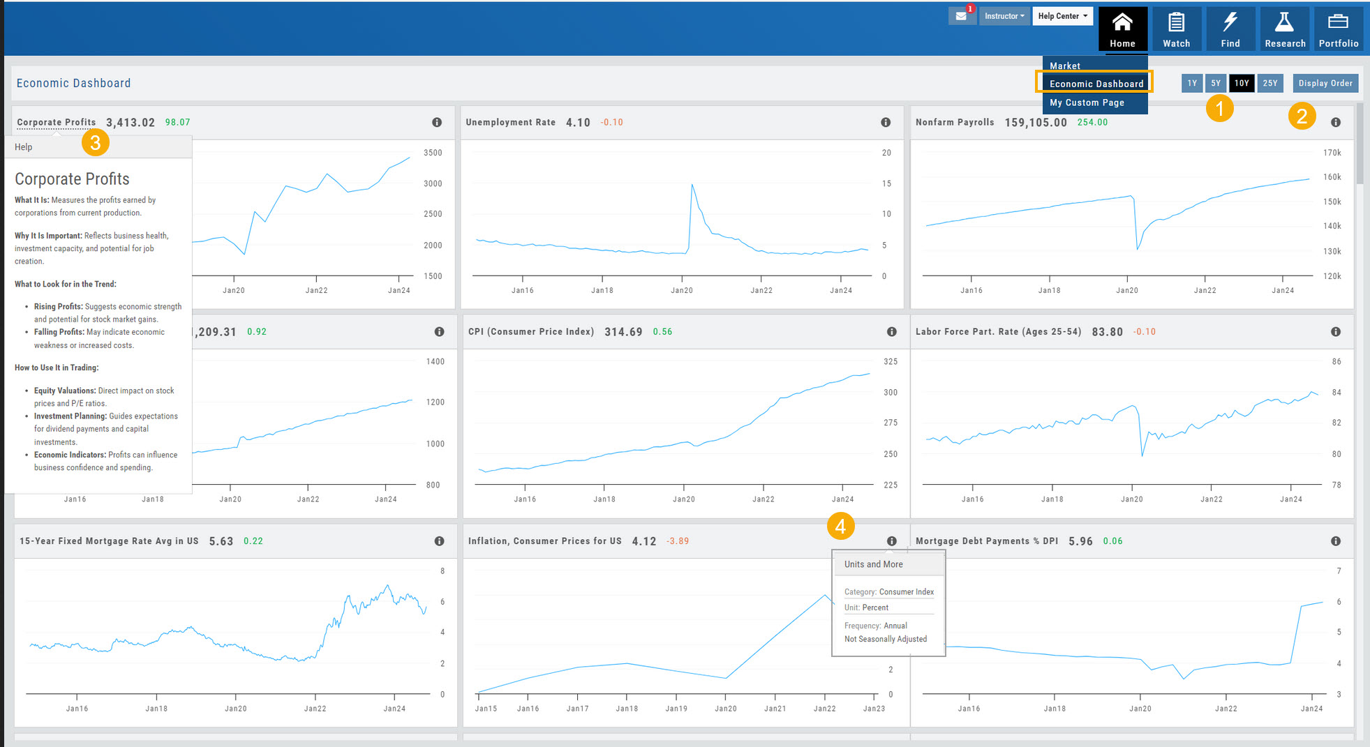
- Select from 1*, 5,10 or 25-year views
- Allows you to select display order as well as ‘hide’ charts.
- Click on the Title to display: What the data represents, Why it is important, What to look for and How to apply the data in trading
- Provides info on the Economic Report Category (Consumer), what the numbers represent (%, $, units, etc), how Frequent the data is reported (Quarterly, Annually, Monthly, etc)
* Some reports are released annually. 5, 10 or 25 year view are recommended in these instances.
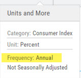
Chart Adjustment
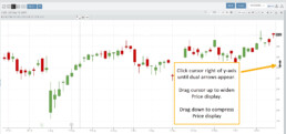
Adjusting the chart’s y-axis gives you more flexibility – whether it’s forecasting, adding notes, viewing current positions, etc.
Simply click you cursor to the right of the y-axis, then drag your mouse/cursor up or down.
To reset, click the ‘refresh’ icon ![]() on the chart toolbar
on the chart toolbar
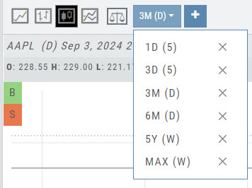
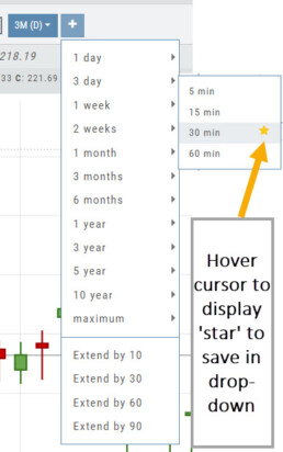
Chart Time Periods
The Chart Period format has been streamlined for a more streamlined look.
The current chart period will be displayed at the top of the ‘favorite’ (saved) drop-down list.
Change Log
- ‘x’ moved to left side of symbol list in Research Tab
- Key Ratio and Compare Views are session sticky
- Seasonal chart corrected to show Price
- Cancel/Reuse display on Credit orders corrected
- Stock data restored on Scan backtest
- Staged Order display on chart functionality corrected
- Schwab Order Ticket close orders corrected
- Trade Station added under “Open New Account”
- Reward/Risk more clearly marked on Trade from Chart
- 1 Day/1 Minute added to Custom Page charts
- Resolved Seasonality percent chart
- Corrected MACD histogram overlap
- 60-minute charts/Schwab conflict resolved
- P/L Insight Graph includes up-to-date data
- Tradier Live Account Ticket credit/debit correction
- Staged Orders/Current Orders display consistency restored
- Screener – Score resulting in 0 candidates resolved
Market - The Big Picture
Start here for the overall outlook.
Designed to show what the overall markets are doing by viewing the graphs, charts and maps. You can change the time frame to check trends, use the maps on the right side of the page for a picture of sectors in relation to the market. Even drill down to industry within the sector and more.

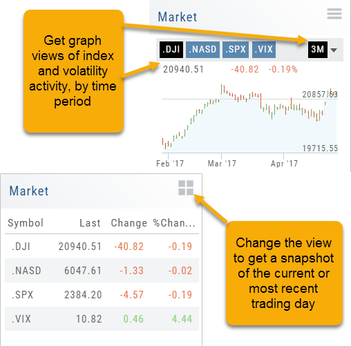
Market Overview: Get more of a broad view
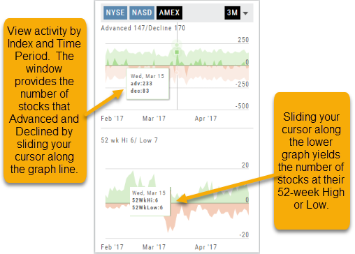
View activity of the NYSE, Nasdaq or American Stock Exchange by time frame. The upper area of this part of the Market Tab shows the number of advancing or declining stocks by sliding your cursor along the graph.
Likewise, the bottom portion of shows the number of stocks that reached their 52-week High or Low by sliding your cursor along the lower graph.
The constant figures show the number of stocks in each category for the current/most recent trading day.
Market - Index Overview
In the default Graph View, get an visual view of Market or Volatility Index activity by a 1-day or 1, 3 or 6 month time frame. By sliding your cursor along the graph, an activity box will display more in-depth activity: Every two minutes for the 1-Day Graph, or Daily for the 1, 3 or 6 month graph.
The current market activity/most recent trading day, regardless of time-frame, is present on the default view under the Index box selections – or by selecting the List View to get: Current, point change and percentage change (green = positive, red= negative).
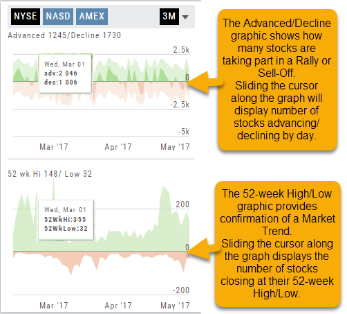
Advanced/Declined & Highs/Lows
The Graphs on the left side of the Market page can provide confirmation of whether there was a Rally or Sell-Off in the time frame selected by providing the numbers of stocks taking part in of the movement.
The 52-week High/Low Graph further confirms if there is a Market Trend by showing how many stocks closed at their 52-week High/Low.
Note, you can select a 1, 3 or 6 Month or 1 Year time frame in which to view the data. By sliding the cursor along the horizontal ‘0’ (zero) line on each graph, data for each day will appear.
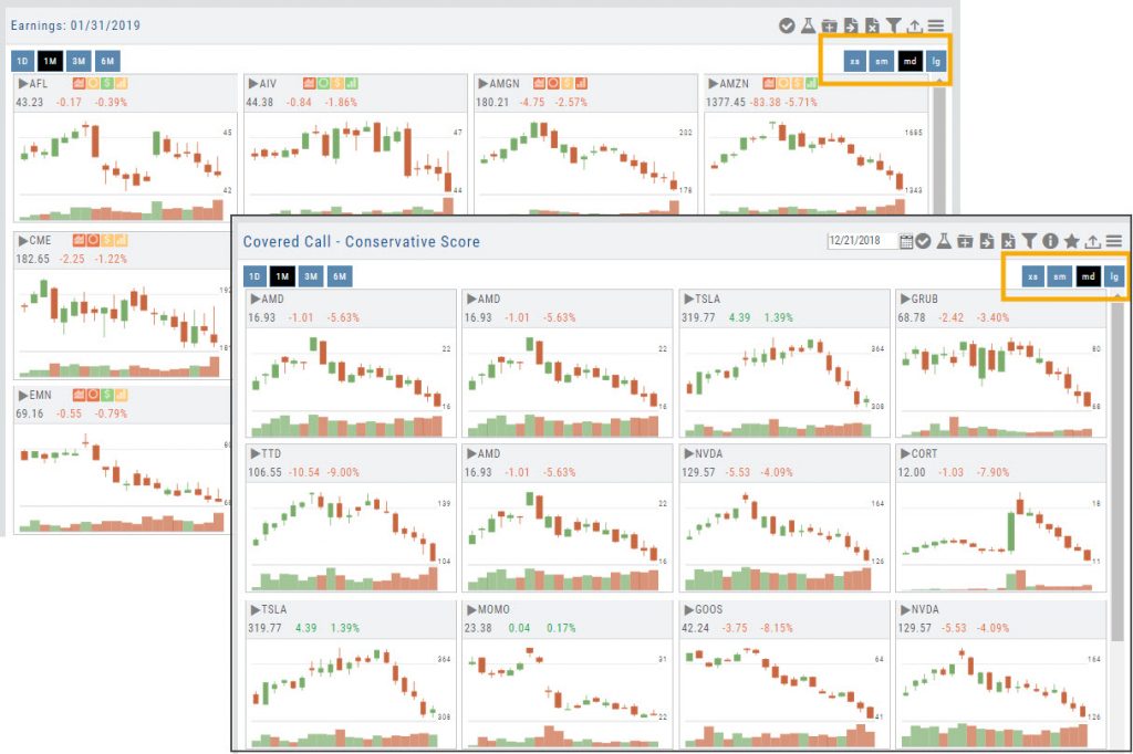
Tile View Sizes
Tile View is available in 3 sizes on the Market or Watch Tabs.
Scans and Earnings/Dividends Calendar under the Find tab offer 4 Tile View sizes: Extra Small to Large.
The platform’s adaptive and responsive technology will automatically adjust the number of tiles shown based upon the available space as well as allow continual scrolling for large lists.
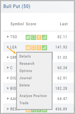
Smart Action Icon
The Smart Action Icon ![]() adjusts available features depending upon where you are in the trading platform.
adjusts available features depending upon where you are in the trading platform.
For Stocks you can ‘Buy’, ‘Sell’, view ‘Options’, etc. 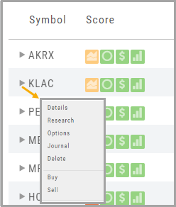
Any Strategy-specific options scan will have ‘Analyze’ and ‘Trade’ in the Action Icon Menu. You can click ‘Analyze’ to see the trade in the options chain. From there, you can Edit the structure or click ‘Trade’ to submit the trade to your to Brokerage Account and Journal.
Heat Map & Spectrum Overview
Broad Market Insight that allows you to drill down
The Heat Maps are accessible in the Market tab and under Find>Explore and provide powerful visual views of market performance. This feature is designed to adapt to a variety of strategies and outlooks according to your portfolio needs. Select Index and Time Frame using the Action Icons. These can be changed going forward in any map screen.
In the Map view, each box represents either an industry group (default) or a stock when you drill down. The size of the box represents the market cap. By hovering your cursor over each box, an info box appears with info on that group within that industry, including the the number of companies, Market Cap, % Change in selected time frame.

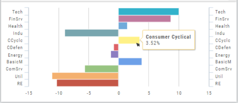
Industry Performance Bar Chart
The Bar Chart is located on the Market Tab and updates dynamically with selected Heat Map Index and Time Frame. This provides an additional view of the overall Market by Industry. Below is a 3 month Heat Map/Bar Chart view of the S&P 500. The bottom Bar Chart shows a 6 month view.
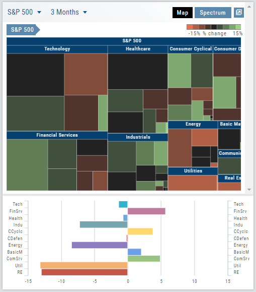
Each Industry is represented by a unique color and are listed by Market Cap – largest on top to the smallest at the bottom. Hover your cursor over each bar for the Industry name and % change of the selected time period to appear.
The center of the Chart is Neutral and will appear blank just prior to the Market’s Opening Bell. Bars extending right of center represents Gains, left of center represents a Loss for the time period selected on the Heat Map.
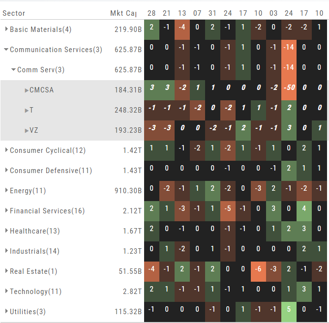
Spectrum Map View
In the Spectrum view, each column represents the slice of time selected: Day, Week, Month or Trailing Quarter. Once the Time frame is selected, it will be backtracked in each column (Example: April, March, February, January…)
Each row of the selected Index are initially broken down by Sector. By clicking the ‘action icon’, the Industry groups are shown. Clicking on the ‘action icon’ of each Industry will display the Stock symbols within that Industry.
The number and color of each box is a ‘slice’ that represents change (+/- , neutral) for that slice of time for that Sector, Industry or Stock using the Spectrum Color Legend as a reference.
Note the ‘action icon’ next to the Stock Symbol, enabling you to drill down, add to Watchlist, Research, Journal, etc.