Rolling Positions
It’s easier & faster to evaluate your Trade
Once you have entered a position, you can easily make adjustments for further evaluation using the group of Rolling Icons in the upper-center part of the Option Table.
These icons will allow you to move the whole position: 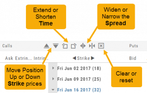
Up or Down Strike Prices
Extend or Shorten Time
Widen or Narrow the Spread
The [X] acts as a clear function. Clicking once will clear the current positions in the chain. Clicking a second time will act as “all clear”. This will clear any snapshot trades and fully reset the option chain.
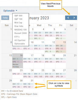
Calendars
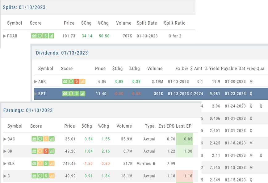
Under the “Find” Tab, Calendar allows one to search for company’s Dividends, Earnings or Splits.
Select “DIV”, “EPS”, “SPL” by calendar date. Use the drop-down menu on the upper left corner to select S & P 500 stocks, All Equities, Optionable, etc.
Use the navigational buttons on the upper right, above the calendar to move the time period forward or back.
Once selected, the stock symbols will automatically populate the right side of the screen. The navigational icons, allow you to perform such functions as select/adding/managing icons to send to a Watchlist or to Research, you can also further Filter candidates.
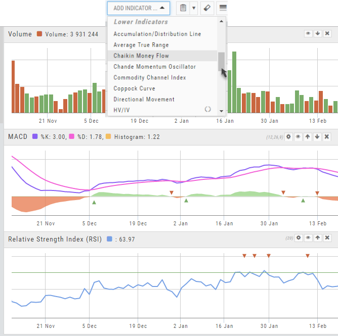
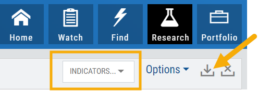
Lower Indicators
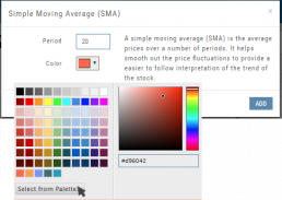
The “Add Indicator” drop-down box has a section of Lower Indicators you can add below the main chart.
Many of the Indicators allow you to customize the parameters prior to adding.
Once the Indicators are in place, the icon tool bar – found on the upper right above each graph- gives you the ability to edit (Gear), hide (Eye), move up/down (Arrows) or delete (X) to truly customize your view.
![]()
Position Download Ability
Downloading/exporting capability added to the Positions tab.
This feature is also available in the “Gains” tab.
This allows even greater flexibility with record-keeping from the Journal/Brokerage Account.
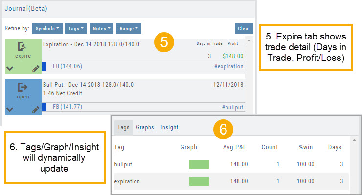
Reconcile Trade Notice
The Tags including the P/L Summary, Graph and new Insight tabs rely on updated Journal entries which includes reconciled trades.
The following notice appears in the Journal when trades needs to be reconciled:
![]()
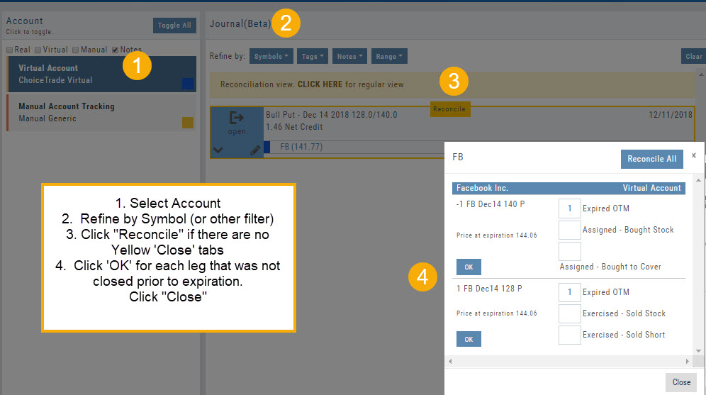
All trades in the trading account(s) selected will display with the option to change back to Regular View:
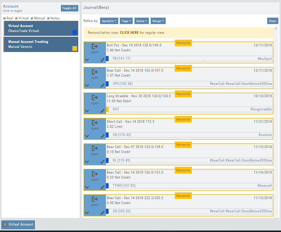
Individual trades are reconciled by clicking on the “Reconcile” tab outlining the Journal Entry.
The Journal Tab will update showing the trade had a profit/loss or adjustment in the underlying.
Elements of the Template
The Trade Finder Templates are designed to allow you to ‘visually trade’.
When evaluating a position, a Bull Put for example, the template automatically sets up the trade. You can use the rolling icons to adjust the position: Roll the position up/down, roll out the time frame, adjust the strikes, etc. You can even adjust the Net Credit(Debit) of the trade in an attempt to get a more favorable entry cost/credit.
The Performance Channels show the profit/loss of the position.
The P/L summary at the bottom left of the screen shows the Risk/Reward ratio, Net/Total Credit (Debit),the break-even stock price point, the max reward/max risk with corresponding stock price.
A snapshot on the right side of the screen, provides a visual structure of the strategy, what market 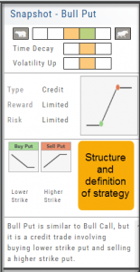 conditions are favorable to the trade, whether volatility and/or time positively, negatively or is neutralized by the strategy.
Greeks and Volatility are also shown.
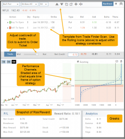
Once satisfied with the position set-up, click ‘Trade’ and the order will auto-fill in the “Order Ticket” of your brokerage account.
Important! While adjustments may to the template may be made, the system limits what can be changed in order to stay within the constraints of the strategy. This safety measure ensures you stay in the type of trade you intend to be in.
Adding & Arranging Indicators
Select ![]() to add to your studies.
to add to your studies.
Indicators are grouped by Upper Indicators (which will appear on the Chart) and Lower Indicators (listed below the chart)
Once selected, you can customize the parameters – including the type of line you want for Moving Averages.
The upper Indicator selection summary appears above the chart and has an associated toolbar that allows edits (gear) hide/display(eye), refresh, or remove.. ![]()
Lower indicators can be displayed/hidden, move placement up/down, or delete it to truly customize your view. ![]()
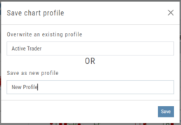
Make sure to Save Your New Chart Settings ![]()
Note: You cannot alter System Views: Active Trader, Options or Standard View. You will be prompted to either Overwrite or Save as a New Profile another available profile, such as Default or another Personal View.
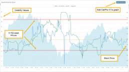
Historic & Implied Volatility
This chart displays Historic (HV) and Implied (IV) Volatility with the ability to overlay Call/Put IV
Historic Volatility (green line) is based on how the stock actually moved.
Implied Volatility (blue line) is based on how the options are priced.
When expanded, the stock chart, 12-Month Mean (Average) IV and one-year IV High/Low (red line) are also shown. This is very helpful in understanding if option premiums are comparable to historic values.
High HV indicates recent strong movement.
High IV indicates higher premium and, in many cases, anticipated movement.
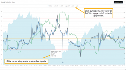
Note: You can remove the Stock Chart, HV, IV or Call/Put IV simply by clicking on the corresponding indicator above the chart/graph.
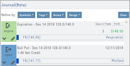
Updating Journal Entries
Logging into your account will update Journal entries for up to the last two months. However, trades that expired will need to be Reconciled. If the system is unable to match trades, a Yellow ‘Close’ tab will result, requiring manual action to close.
Follow the steps as shown below to reconcile your trades.
Note: Step 2 is not required, however, if you are just learning to use the Journal and it’s features, sorting by Symbol, especially if you have multiple trades, simplifies the process.
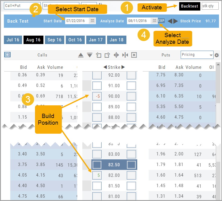
How to use Backtesting
Activate by clicking “Backtest” in the upper right of the Option Table screen.
- Select a start date.
- Enter position in the options chain.
- Select analyze date.
Your position’s P/L Performance and Risk Chart are dynamically updated.