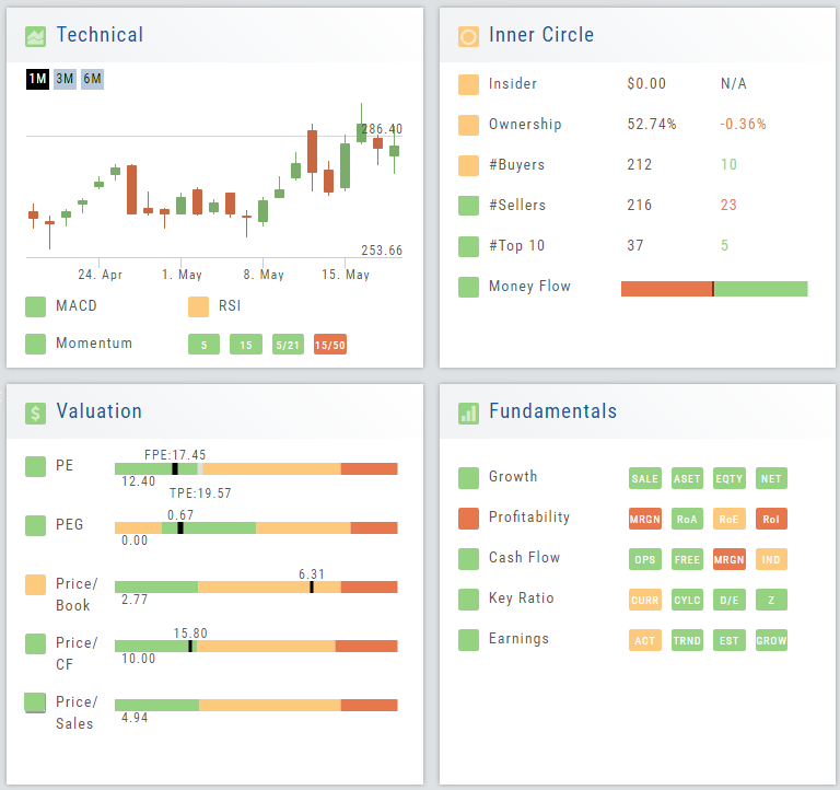
Valuation
Is it Overvalued or Undervalued?
Valuation looks at Key Ratios and Projected Price to evaluate the stock’s current value.
Key Ratios like both trailing and forward PE along with PEG (Price/Earnings/Growth) are weighed.
The Price compared to Book (flow of business), Cash Flow, and Sales are also very important factors to provide a well-rounded synopsis of the valuation modeling of the stock.
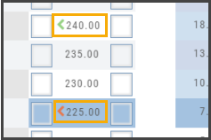
Position Indication on the Chain
When evaluating an existing position on the options chain, the positions held are indicated with arrows on the chain. The arrows point to the quantity entry box of the held position.
Green arrows ![]() indicate Long or Buy positions.
indicate Long or Buy positions.
Red arrows ![]() indicate Short or Sell positions.
indicate Short or Sell positions.
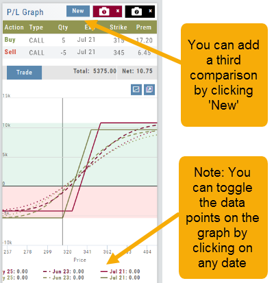
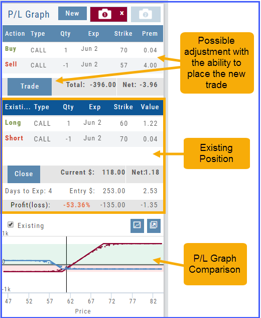
Snapshot: Comparing Positions
The Snapshot feature gives you the ability to compare up to three scenarios in one view without having to change screens or erase previous setups. You can even submit a trade from this part of the platform!
- From the Calls+Puts chain (as well as “Calls” or “Puts”) enter the initial trade position.
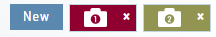
- Next click one of the camera icons:
- Repeat the first step using the Rolling Icons to adjust the initial position to a new scenario:
- Click the 2nd camera icon & repeat the above steps for the last trade comparison.
Note: The position lines are color coded to match the Snapshot (or New) icon.
Once you decide on the optimal position, click ‘Trade’ from the P&L Graph and you’ll be taken to the Order Ticket of your brokerage account with the option information auto-filled. 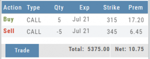

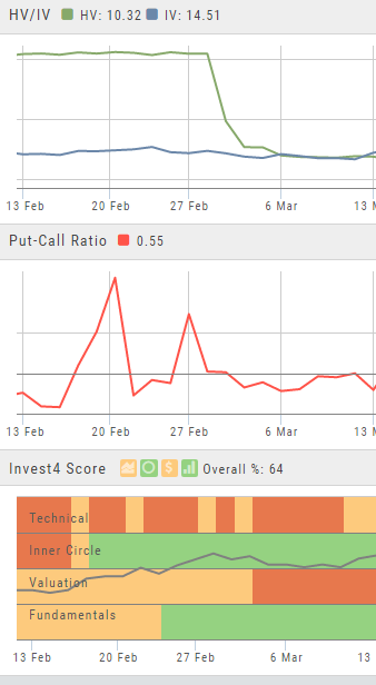
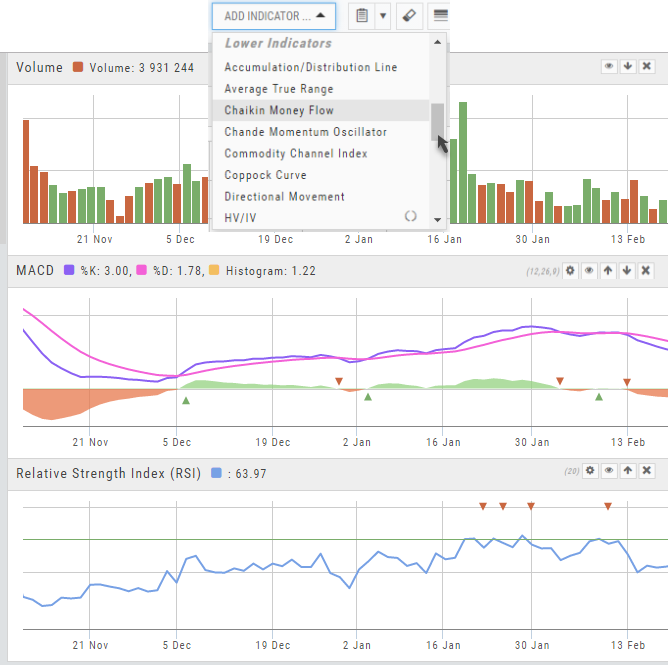
Advanced Indicators
We offer select Advanced Upper and Lower Indicators that are not just derived from the price, including proprietary indicators like “Invest4Score” and “Insider Score”. They are accessible by using the “Add Indicator” drop-down box.
Upper Indicators include:
- Event Flags – showing Earnings and Dividends
- Journal Display
- Support/Resistance
- Extrema Trend Lines
Lower Indicators include:
- Historic Volatility/Implied Volatility
- Insider Score
- Institutional Percentage
- Invest4 Score
- Momentum Score
- Open Interest
- Options Volume
- Put Call Ratios
Fundamentals
A complete perspective of performance in one place.
Fundamentals looks at 20 critical financial analysis ratios in 5 different categories: Growth, Profit, Cash Flow, Key Ratios, and of course, Earnings. 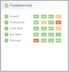
We also take into account Quarter over Quarter, Year over Year, and Trailing Twelve Months’ (TTM) performance with our proprietary weighting formula. View historical data by clicking on the upper right corner buttons in each window.
Fundamentals is the slowest of The Score components to affect stocks, due to the limited times throughout the year data is released. Active investors would generally place more weight on Fundamentals than would a very short-term trader.
Trade Management
This platform makes it easy to manage and adjust trades when needed. The Snapshot feature and the P/L graph enables you to visually assess adjustments.
Once the existing trade is showing on the options page, take a ‘snapshot’. Enter the adjustment, then take another ‘snapshot’.
To submit the adjustment to the Order Ticket of your brokerage account, click “Trade”. The smart ticket system will even handle the trade adjustment automatically by entering the appropriate buy/sell, open/close combination. 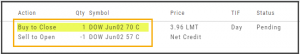
Rolling Positions
It’s easier & faster to evaluate your Trade
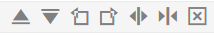
Once you have entered a position, you can easily make adjustments for further evaluation using the group of Rolling Icons in the upper-center part of the Option Table.
These icons will allow you to move the whole position: 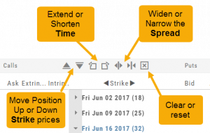
Up or Down Strike Prices
Extend or Shorten Time
Widen or Narrow the Spread
The [X] acts as a clear function. Clicking once will clear the current positions in the chain. Clicking a second time will act as “all clear”. This will clear any snapshot trades and fully reset the option chain.
Lower Indicators
The “Add Indicator” drop-down box has a section of Lower Indicators you can add below the main chart.
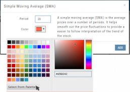
Many of the Indicators allow you to customize the parameters prior to adding.
Once the Indicators are in place, the icon tool bar – found on the upper right above each graph- gives you the ability to edit (Gear), hide (Eye), move up/down (Arrows) or delete (X) to truly customize your view.
![]()
Elements of the Template
The Trade Finder Templates are designed to allow you to ‘visually trade’.
When evaluating a position, a Bull Put for example, the template automatically sets up the trade. You can use the rolling icons to adjust the position: Roll the position up/down, roll out the time frame, adjust the strikes, etc. You can even adjust the Net Credit(Debit) of the trade in an attempt to get a more favorable entry cost/credit.
The Performance Channels show the profit/loss of the position.
The P/L summary at the bottom left of the screen shows the Risk/Reward ratio, Net/Total Credit (Debit),the break-even stock price point, the max reward/max risk with corresponding stock price.
A snapshot on the right side of the screen, provides a visual structure of the strategy, what market 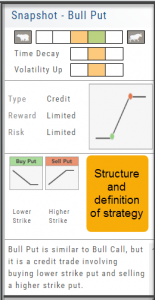 conditions are favorable to the trade, whether volatility and/or time positively, negatively or is neutralized by the strategy.
Greeks and Volatility are also shown.
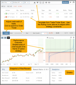
Once satisfied with the position set-up, click ‘Trade’ and the order will auto-fill in the “Order Ticket” of your brokerage account.
Important! While adjustments may to the template may be made, the system limits what can be changed in order to stay within the constraints of the strategy. This safety measure ensures you stay in the type of trade you intend to be in.
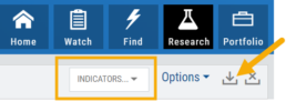
Adding & Arranging Indicators
Select ![]() to add to your studies.
to add to your studies.
Indicators are grouped by Upper Indicators (which will appear on the Chart) and Lower Indicators (listed below the chart)
Once selected, you can customize the parameters – including the type of line you want for Moving Averages.
The upper Indicator selection summary appears above the chart and has an associated toolbar that allows edits (gear) hide/display(eye), refresh, or remove.. ![]()
Lower indicators can be displayed/hidden, move placement up/down, or delete it to truly customize your view. ![]()
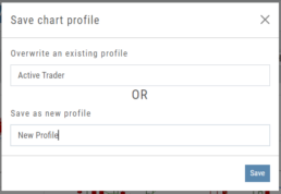
Make sure to Save Your New Chart Settings ![]()
Note: You cannot alter System Views: Active Trader, Options or Standard View. You will be prompted to either Overwrite or Save as a New Profile another available profile, such as Default or another Personal View.