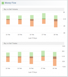
Activity by Volume & Number of Trades
Money Flow shows trading activity in two views.
The darker shade in the middle of each column – either dark green or red- indicates difference
between the buy/sell volume and buy/sell number of trades.
For example, on February 27th, the top graph shows approx. 1.75 Billion
buying volume from just over 50k trades (bottom graph). Selling volume of
approx 1.5 B resulted from less than 50k trades.
Where the volume and trade columns overlap is an indication of
‘big money’ (Institutions) moving in(dark green)or out (dark red)
of the stock.
Note the dark green line overlap on both graphs for the Feb. 27th example.